Because I was not feeling 100%, I spent a bit more time reading during the trip to Berlin. I discovered Sophie Taeuber-Arp! Of course I had heard of her before, and seen some of her woven tapestries. But now I have read her Biography, been to the Bauhaus museum and looked on the internet for images of her work, and I am so excited. She was the first to find geometrical abstraction. Her art has a wonderful playfulness and experimentation, exudes happiness and celebrates colour, while reducing shapes to the most basic geometric shapes. She was a quiet person, not wanting to put herself forward, even quite shy inviting friends to visit her studio. At the same time creations were pouring out of her in so many different media: paintings, fabrics, tapestries, Marionettes, useful objects, interior design, sculpture.
I found a couple of presentations telling about her life, the places she lived, the exhibitions: https://www.srf.ch/kultur/kunst/big-dada/die-marionetten-der-sophie-taeuber-arp. She came from a humble background in the Swiss mountains, took herself to an art school in Germany, became a dancer before turning to visual art, was instrumental in the Dada-movement in Zürich, edited an art magazine, was friends with the art scene and its representatives in Paris, sculpted, designed costumes, became an interior designer, and was largely unrecognised during her life time. She must have had fun with her husband Hans Arp and their friends, but was also practical, the breadwinner for both of them. I admire her as an avantgarde artist of her time, as a courageous female in a time when women were still described as housewife, or wife of their more famous husband. She was at the front of opening up art to include crafts and creative skills using all kinds of materials. For this reason, I feel a kinship, as this is very much the paradigm of the origins of Occupational Therapy.
The sketches I made clearly show that passengers, during their waiting time, are focusing on and thinking about something or somewhere that is not in the “here and now”. They are also not communicating with each other, unless they are a family or are travelling together. However, when I started a conversation, most people I contacted were very happy to have a little chat with me. Unfortunately, I didn’t ask them, if they would enjoy an opportunity to pass the time having a conversation with someone. But, the bike person seemed to enjoy our conversation so much that she said so and introduced herself to me!
ideas to sweeten waiting time
At the Wellcome Collection the Friendship Bench was exhibited – a project to address mental wellbeing that was started in Zimbabwe and has now been installed in other cities. “Grandmothers”, community volunteers, trained in listening and a cognitive-behavioural approach are placed on a bench in a hospital.
This approach is a bit too formal for a transitory place such as a station. But, a variation of it might be worth a try? Jacques Salome, a sociologist and psychiatrist, suggested benches or tables could be marked as “Conversation Spaces”, maybe even be labelled with the language spoken at this table. This kind of approach has been adopted in several places. However, it needs monitoring and people are employed to oversee it and discourage misuse.
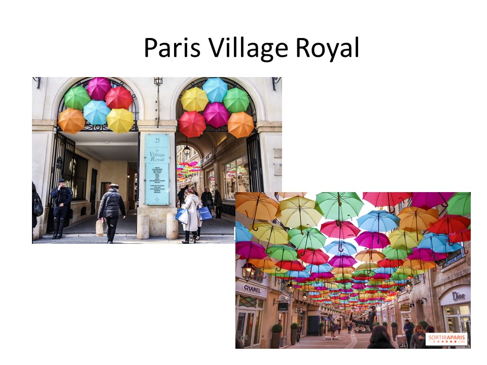
I envisage the occasional bench or small group of chairs (3?), under an umbrella. The umbrella would indicate that this space is for conversation. Maybe the umbrella could have a smiley face?
I also like the idea of bicycle stations where you can load the battery of your mobile. The bikes are arranged around a circle, so chatting while cycling is encouraged.
there will be more demands on travel on public transport;
there will be an increase in frequency and intensity of extreme weather event.
Reducing carbon from car and air travel and getting passengers to their destination as efficiently as possible is exactly what we want to be doing, but more passengers and more trains will provide challenges for our rail network.
trends such as the Internet of Things (IoT), robotics, virtual reality (VR) and artificial intelligence (AI) are changing the way we live and work.
this blog is focusing on staff requirements (the blog is called unionlearn)
Rail stations will become destinations and lifestyle centres that further blend our commute with our lives. People are increasingly using stations, not just as places to catch a train, but as centres for leisure and business. Of nearly a million weekly visitors to London’s St Pancras station, a quarter come to eat, drink or shop rather than take a train. This trend will continue as stations become places of experiential retail and also provide facilities such as gyms, hairdressers, meeting spaces and offices. New York’s Grand Central Terminal is also a destination in its own right. Some features of the station include the ceiling mural above the vast main concourse, the famous Oyster Bar, and The Campbell Apartment, an elegantly restored cocktail lounge. The stations also has delis, bakeries, newsstands, a gourmet and fresh food market, an annex of the New York Transit Museum, and more than forty retail stores.
Further key words: Energy from footfall; ticketless technology; Hydrail
I think my reflections are largely made visible in the blog. Looking back to the journey so far, it has been quite an amazing journey. I have learnt so much:
what have i learnt?
I have a go at using computers that I don’t know with more cofidence: android and apple computers, and laptops.
I have learnt that getting to know and use new programmes and apps takes a lot of time and perseverance. I think I would rate myself quite high on perseverance – I have not given up with difficult programmes such as photoshop or indesign, or techsoft for Lasercutting. I am more forgiving if things don’t work out for me, or if I can’t remember an action on the computer that I have done before. I know that practicing and repeating actions is necessary in my case and will get me there in the end.
The course has only partly met my expectations. On the whole, it was much less practical than I had expected, and much more electronic activity. But I am proud of myself that I did not give up. There was plenty to make up for this!
To my own surprise I have hugely enjoyed the research process, looking up artists, architects etc., getting to know contemporary art, projects, buildings.
I have discovered that the research bit of the course creates a very welcome challenge, which I am able to meet and enjoy.
I have also found ways to use the skills that I am good at: powerpoint; bead work; type setting; cutting and glueing; reflecting.
Above all, I have never thought about art and creativity in the way that is taught at Brookes. This has been steep and very interesting learning. I appreciate art in a completely new way. Researching artists and reading what they say about their own work has given me new insight into how artists go about their work. For example the data artists – a world I had no idea existed even.
I have learnt that creating takes time. I recognise the design process and go through it with much more awareness, and intensity of thinking, dreaming and research. The double diamond design process that Sarah introduced us to is helping me to get through the uncomfortable space of feeling stuck and not knowing where to go next. I now know that this is an integral phase of the creative process, and if I am feeling desperate and ready to give it all up, or feeling incredibly stressed, I have confidence that this is transitory. I have known and experienced that creativity needs emptiness to emerge. I now also recognise that it can require an overcrowded space with too many directions to choose from.
I got to know the tools in the workshop and clay as a very lovely material. It has given me confidence to use powertools such as electric drills and band saws and sanding machines, and maybe even laser cutting.
I am beginning to manage the time better. I have made a promise to myself that the course has priority for the time being. But recognise that for spiritual comfort I also need my singing and time with friends. I give myself permission to cancel when things get too busy!
I have made friends with fellow students 40 years or more younger than me!
I have discovered new aspects about myself. During the day we spent at the Railway station I hugely enjoyed going up to people to have a little conversation. This is something new, when previously I have always thought of myself as being shy and introverted!
I have always been quite self directed, but I have also an ingrained respect for authority. This used to make me do what is expected without querying it! Now I am beginning to see that I am just doing this course for my own pleasure. Consequently I choose carefully what I complete for the course and am more confident to leave out what I don’t find interesting or helpful for my journey. After all, the creative process should arise from the inside……
What have i learnt about my art?
I have chosen pathways outside my comfort zone. I have deliberately NOT chosen painting and fine art, because I was curious to explore other ways of expressing ideas.
I am a little disappointed that I have not had an opportunity to explore screen printing. But, I have my doubts that this is a technique for me, because it seems to me rather precise and with very clear-cut boundaries, lines, shapes.
Even though I have shown perseverance and determination, I can get bored and tired with executing ideas and making things, when the actual making takes a lot of time. Watercolour painting is a very immediate process where you instantly make a mark and see the effect.
I heard myself sing while working with wood or clay, or working out things with wire. I think those moments of being with myself, the material and my hands have been very happy moments, even when things (like the wrong type of wire for the job) did not go as hoped or planned.
I know that electronic work is not what I enjoy. I have also discovered that the process from having an idea for a 3D object to bringing it out into being is not straightforward and can take a lot of exploration. Even sketching an initial idea is actually a very difficult thing!
I do enjoy the challenge of combining 2 or 3 ideas and making something unique and new.
So, where do my future projects emerge from? I don’t know, but maybe they will somehow come about……
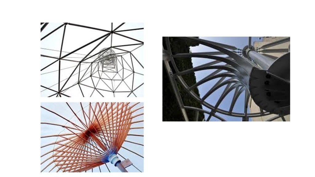
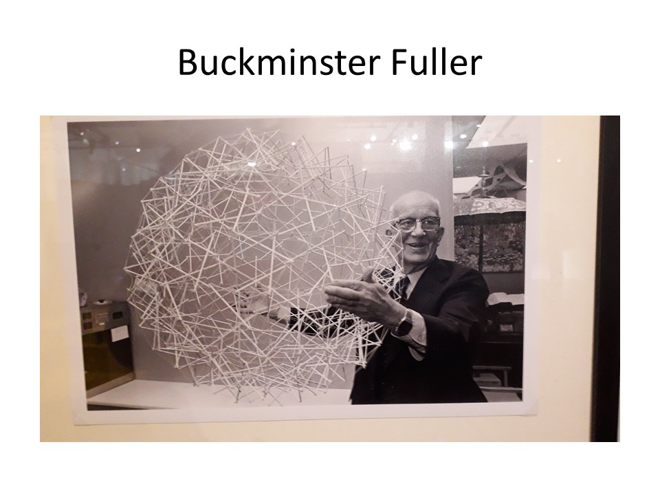
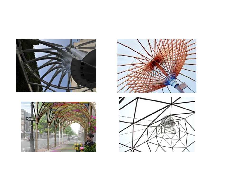
I did some more research into umbrella-type structures. Amazing what I found – mindblowing!
Metropol Parasol in Seville. A wooden structure glued. Walkway on the top
Architect Juergen Mayer
Ideas: neighbouring trees, Seville Cathedral.
Interview with Mayer: “I have this obsession with the data protection patterns you find on the inside of envelopes, for example. This is exactly the way we control access to personal information, or camouflage or blur personal information from a public; a neutral face. These forms of control and access, of enveloping space, enveloping a certain kind of environment, this is interesting for us. The interesting part of sustainability for us – besides trying to be “good” and do the right thing – is that it moves the attention of architecture again back to the future. Post-modernism and Deconstructivism were always so concerned with referencing the past, or anchoring a building in some sort of tradition. Sustainability flips this focus back to the future and creates a certain hope and idealism for a better future. Architecture is always about a better future, otherwise nobody would invest in it or care about it, right?
Zoo Design in Zürich, Switzerland. Architect Markus Schietsch
Adam Kushner, inhabitat.com
Kushner and D-Shape use 3D-printed blocks that are made of sand, dust and gravel that are bonded by a magnesium-based material. The end result is an eco-friendly “artificial marble” that has “a resistance and traction much superior to Portland Cement.
I like the shapes cut into the material, the irregularity of it. That would be fun on my umbrella shape!
The above picture was found on a blog, talking about materials for construction.
I found another fascinating material – Canopy Tensile Membrane Structures (could not download picture). Applications: Canopies. Characteristics: Specially designed cables and fittings, customized, range of highly engineered membrane materials, cold-formed carbon support structures, sustainable, low maintenance.
Adaptive Structures
And then I looked for ways to create a design of the surface to cast interesting shadows, or just interesting to look at:
Glass
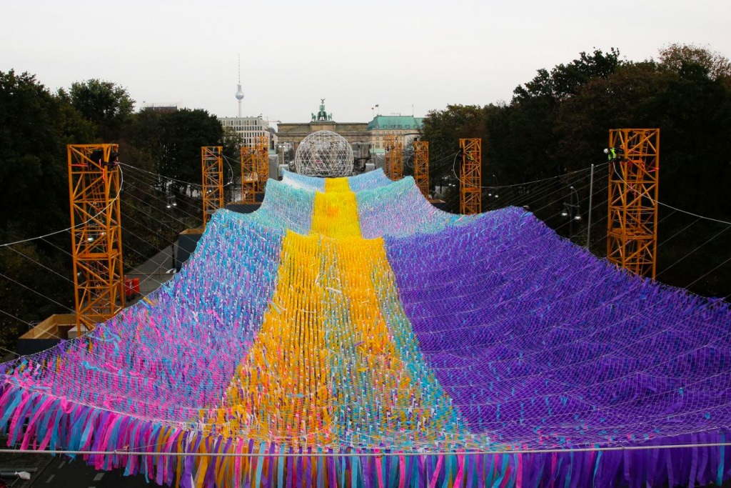
Ribbons (Berlin, to point to where the wall used to be)
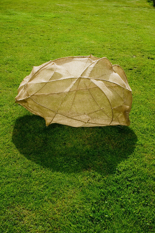
Banana Leaves could provide inspiration for me.
Banana and palm leaves were historically the primary writing surface in many nations. They are used as a parasol in hot countries.
The structure of each segment of my umbrella could be inspired by these leaves. As they have a connection to writing, this could be appropriate for an academic environment such as Oxford.
materials
I think the Kushner and D-Shape material made from sand, dust and magnesium would work very well with the irregular shapes cut into it like windows. That would be an eco friendly material.
The banana-shaped cupola version I see as a building made from steel (painted white), glass and concrete.
I have considered coloured glass to give a friendly feel, but not followed it up.
sculptures
And Sculptures that are somehow related to the shape of an umbrella, or structure of the umbrella?
Crusoe Umbrella was created from steel by Cleas Oldenburg and Coosje van Brugeen. The artwork was dedicated in 1979.
Cowles Common, Des Moines, Iowa
I love the simplicity of the design and the courseness of the metalwork.
“This sculpture consists of three structures made by branches that are joined with thread ‘one-by-one’, creating different shapes. Subsequently, the sackcloth is stitched up to the branches and eventually the whole structure is covered with layers of hemp and raw beeswax.”
I like it. It reminds me of one of my wire sculptures.
Yschool, Machen, Wales
Made by primary school children. It is made of willow branches, but still reminds me of the structures of an umbrella – maybe because I have been working so much with such plastic in the last couple of days!
This is a model I made for a sculpture, a water fountain, using paper clay. I imagine a trickle of water dropping into this fountain. It’s shape is in response to a folding umbrella upturned and sitting with the handle up in the air (photographed before firing).
I make a start. It is difficult to draw the image I have in my head. Maybe my hands can do it better?
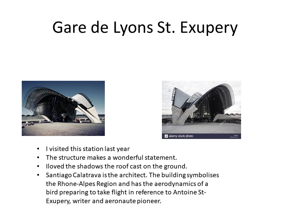
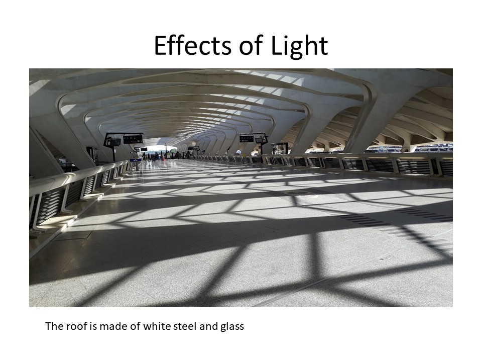
It looks like a train with a nurses’ cap! The canopy is not the shape I am thinking of. And anyway, what does Calatrava’s idea have to do with Oxford?
I wanted to create more space. This doesn’t. I have to look into scale and proportions.
I look up a floorplan on the internet. I scale down the human shape so that the structure is proportionately bigger.
Evaluation:
2 footbridges – less congestion
doors not opposite each other – less draught
not enough space
weak on context: where does the idea of the shape come from? what does it have to do with Oxford? or with anything else?
context
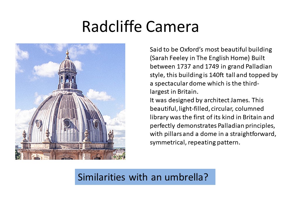
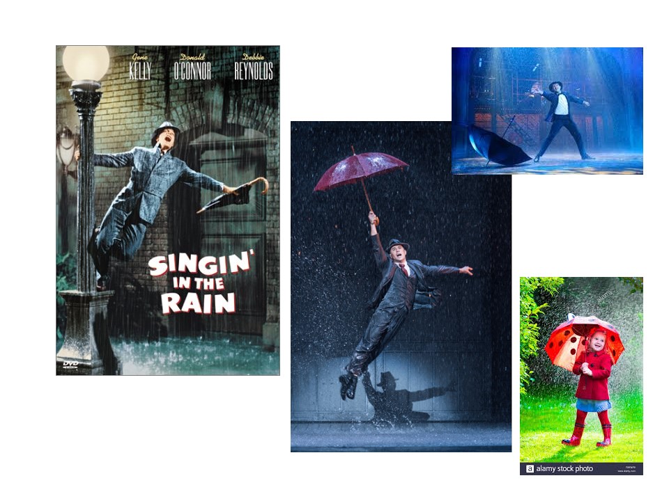
I look at Oxford architecture. I like the rounded shape of my first idea and dismiss jagged, gothic shapes. I love the shape of the Radcliffe Camera and its similarity to an umbrella (see research in earlier blog).
Both shapes offer interesting structures. The umbrella traditionally gives importance and power to the person it shades; it brings people together.
Wire and plastic
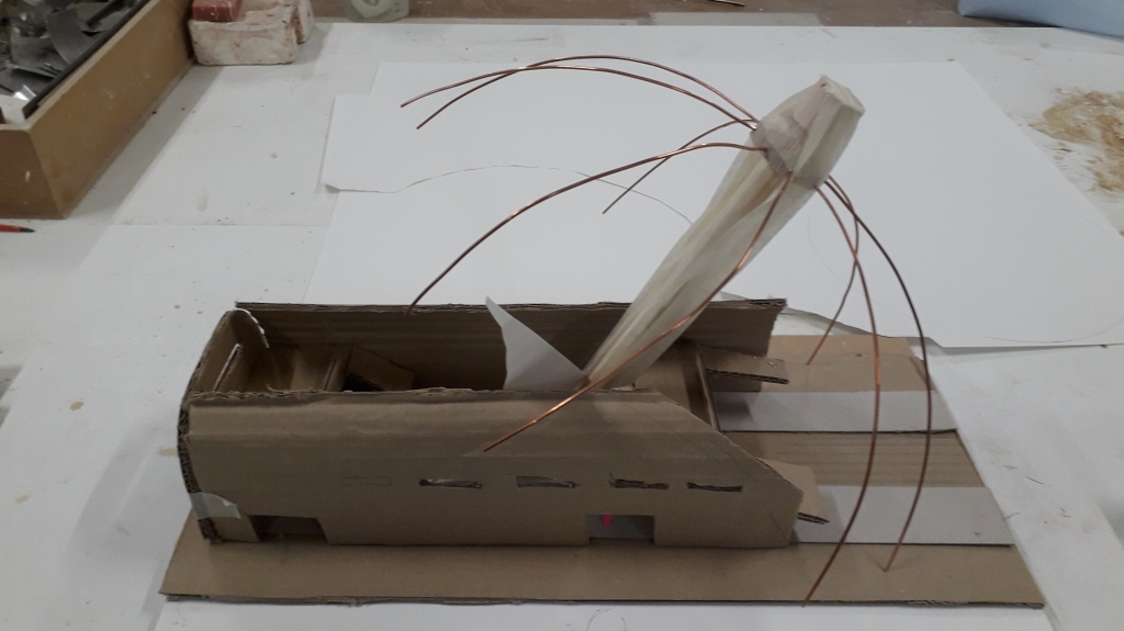
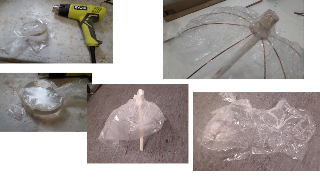
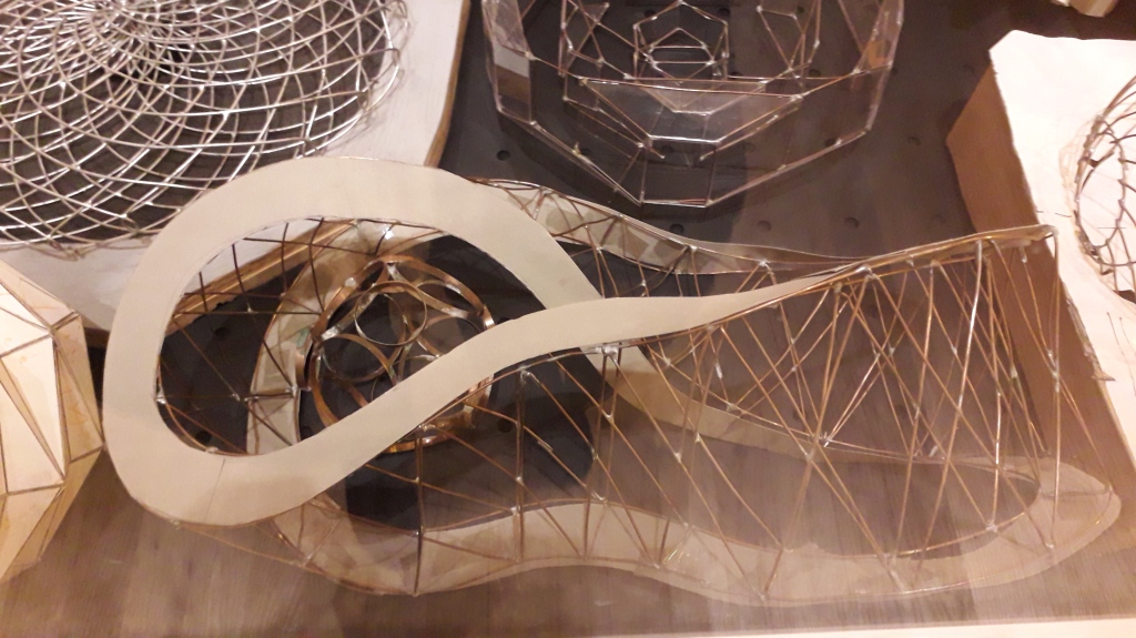
I create a cupola/umbrella shape using 4 copper wires, but then can’t fix them to each other. I am pleased with the shape.
I make the top with wood and drill holes to fix the wires.
I looked up how to make an umbrella and drew a basic shape for each segment; cut it out from plastic wrapping I brought from home; fixed the shapes together with masking tape.
Evaluation: From the outside it looks like a cupola, from the inside like an umbrella. The Heath Robinson way of making it looks a bit clumsy. Can I make the plastic take up the shape, i.e. shrink?
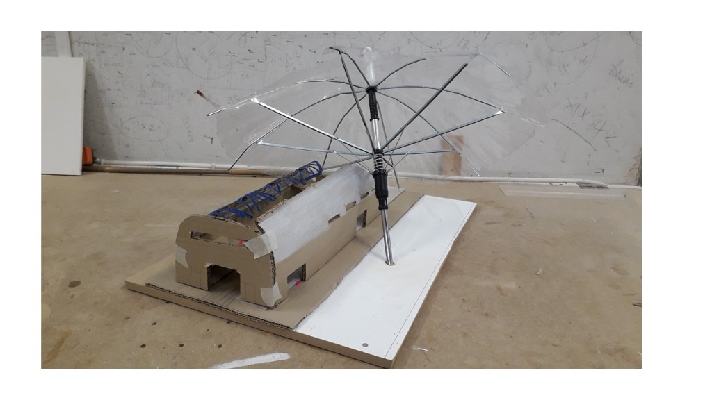
Evaluation: I like the angle – a bit quirky and out of the ordinary.
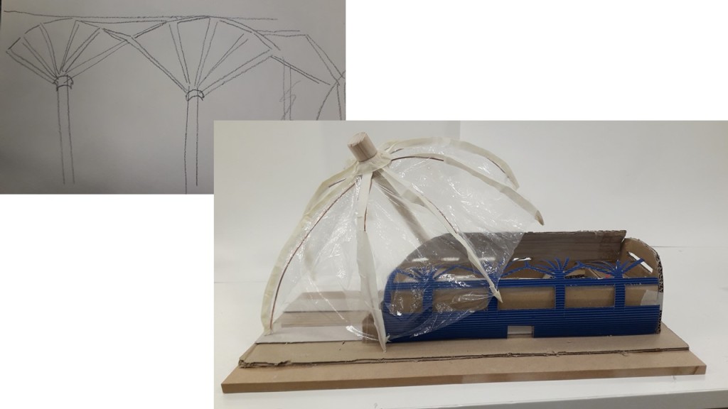
Can I use the wonderful structure of the umbrella elsewhere? The blue canopy is like the mechanism of the umbrella, but also like a tree.
I like the structure of an umbrella
from inhabitat.com, an architectural site
Can I make the plastic take up the shape, i.e. shrink? I try the heat gun. It works, but shrinks from all sides. The plastic would need to be fixed on all sides.
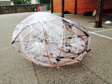
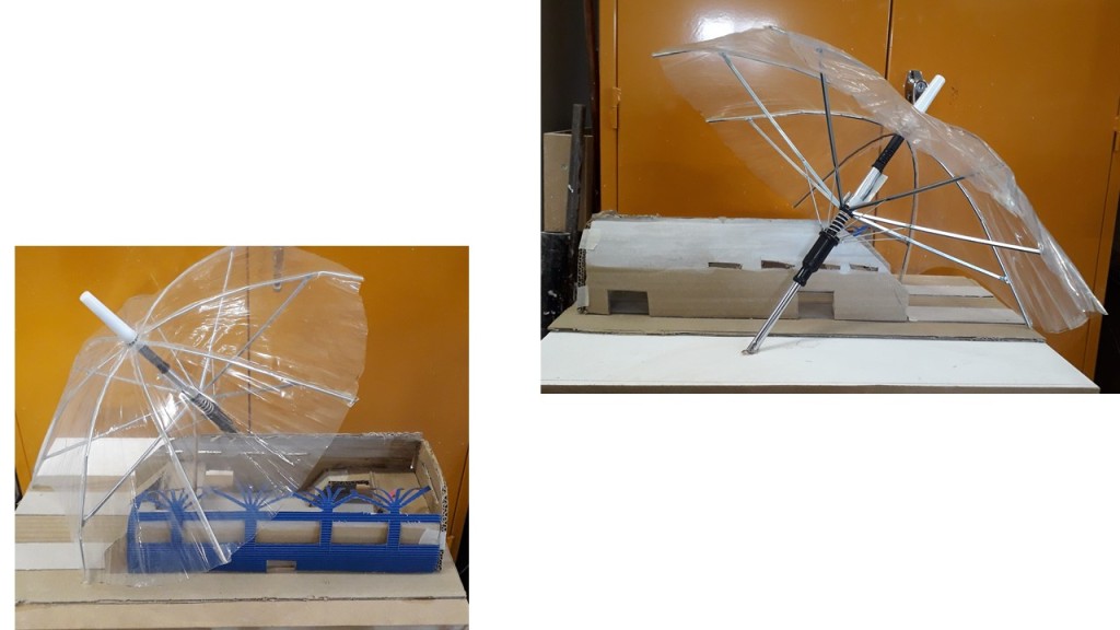
Interested in doing something with the mechanism of the umbrella, I get an umbrella at the lost property office at the station (nice that the umbrella used should come from the station!) and manipulate it to get my shape. As I cut off the plastic, the top of the umbrella looses its curve and is pushed up straight by the mechanism. I gently make a number of kinks in the metal rods and place a metal sleeve to stop it pushing up (orange arrow).
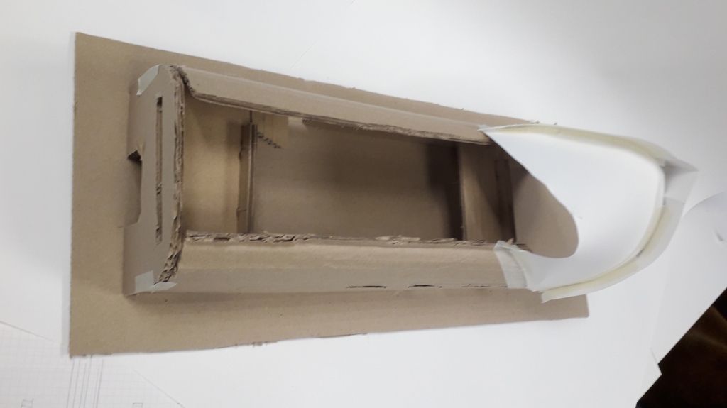
the finished model so far
Evaluation: now you can see the mechanism. I would like that structure to be in my final piece. I am pleased with the way I conquered the umbrella and made it work for my model.
However, it looks like a straightforward umbrella. It lost the original cupola shape, which is a much more pleasing, more unique shape, and which has its strong link to Oxford. So, my next model would have to be a combination of both.
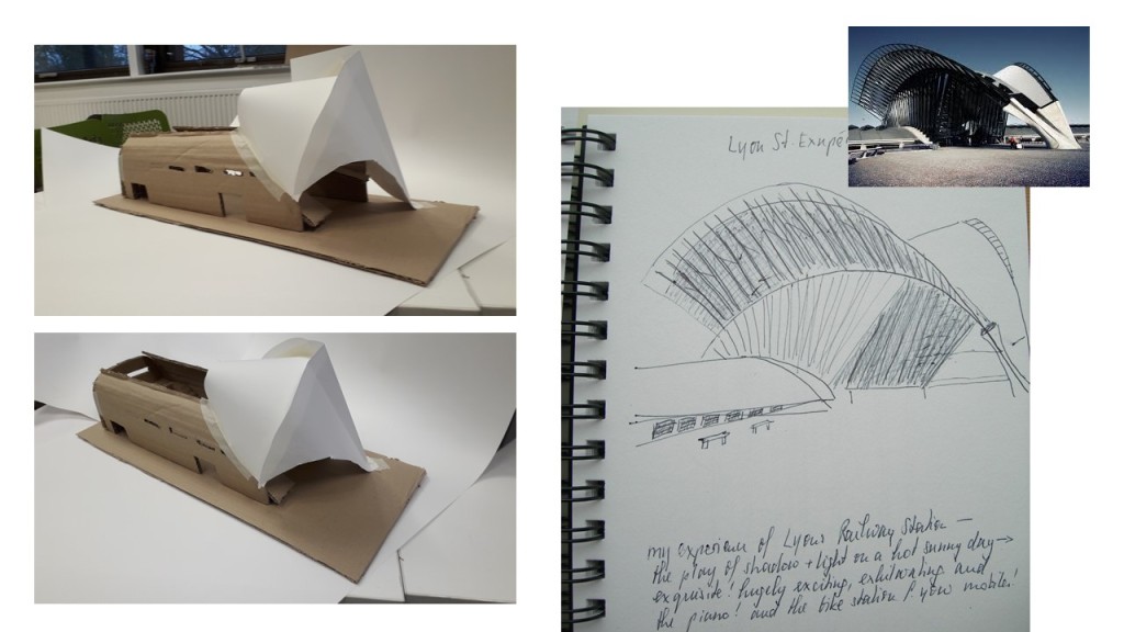
I seem to have a problem updating my previous, so I try to continue here. I have made a ppt presentation that shows my research and the development of ideas.
Reflection: Following the Critique – I presented the above ppt presentation – I reflect on the comments and my own evaluation. I think I have shown evidence of primary and secondary research. The comments on the slides and my verbal comments demonstrate insight and reflection, considering various options and discarding them. I showed a very basic model with my two main ideas – a roof similar to the one of Lyons St. Exupery Station (Santiago Calatrava); a structure sheltering the station that reminds of the Radcliffe Camera and an umbrella.
I received positive feedback on the idea of the umbrella and the feeling of importance it gives to the person below. I was asked about ideas for materials and was told I should look for answers in my research.
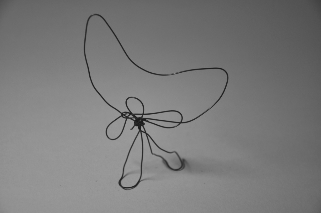
I evaluate my model and will be working on it this week. I used a very flexible wire which is not very suitable. I need to think about colour and materials. I still have some problems with the structure.
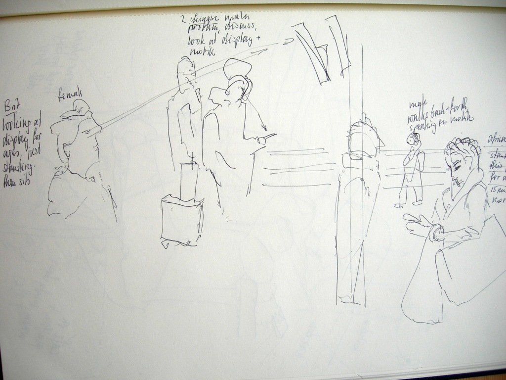
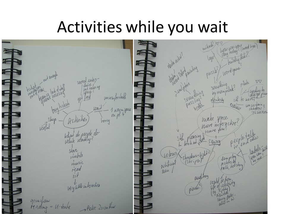
I have no idea what I will tackle! first explore, gather data, go and draw, watch, see where my interest takes me. I have of course issues with the railway station: 1 it is drafty; 2 not enough room to wait; 3 chaotic bike parking; 4 not clear which bus you catch where; 5 during busy times people coming in and going out, traffic is chaotic; 6 if you have missed your train and have a long wait, the only attraction to sweeten your wait is food; I am sure there is more.
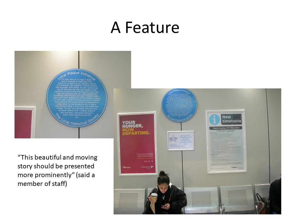
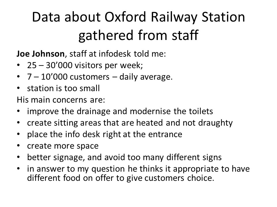
Sarah introduced us to the double diamond design cycle: discover – define – develop ideas – deliver. So yesterday we spent a whole day at the train station, discovering. There was so much to observe, notice, take in. I tried to keep an open mind, although I had a vague idea what I would be interested in. I spoke to Joe Johnson, the infodesk man. He told me there were 25 – 30.000 visitors per week; the average day sees 7 – 10.000 customers. He strongly feels that the station is too small, and apparently there are plans to add another platform. Does he have input in the planning of the new station? not directly, but yes, through the senior management. His main concerns are:
improve the drainage and modernise the toilets
create sitting areas that are heated and not draughty
place the info desk right at the entrance
create more space
better signage, and avoid too many different signs
in answer to my question he thinks it appropriate to have different food on offer to give customers choice.
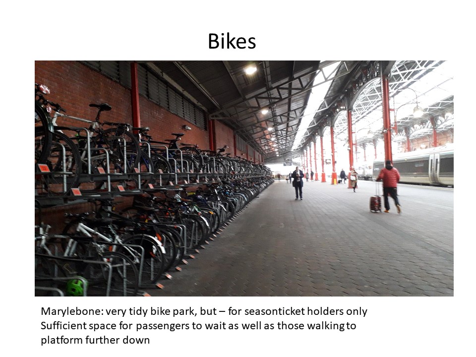
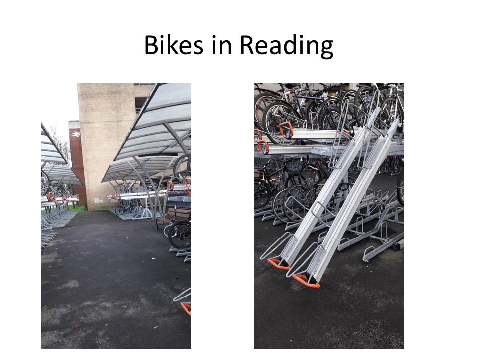
I spoke to a bike user (Ann) at length after observing her difficulty finding a free space. The bike parking is such a mess, inadequate, a disgrace for a city such as Oxford that has a reputation for cycling! She mentions Reading station has better bike parking facilities. (later I make the journey to visit Reading station and see the double decker bike parking. I wonder how easy it is to use the upper deck? how much strength is required? suitable for my age group?). As I turn back to go into the station, I see a Japanese female who hesitates and is looking for the entrance. She turns to what is a tiny service door on the side of the station! I point her in the right direction.
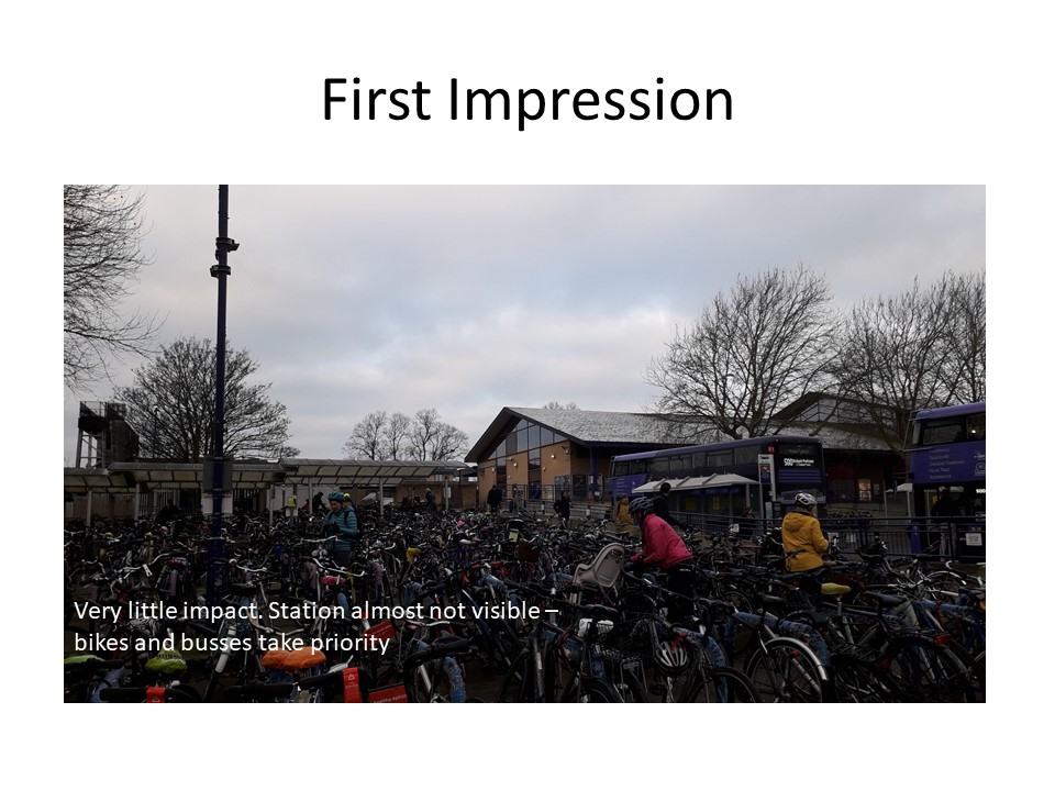
I take lots of photographs of the entrance, and try to imagine what a first-time visitors experiences. Coming off the train you see several rows of buses and taxis, blocking any view you might have. Unclear which bus to take, where is the centre of Oxford? If you approach the station from Frideswide square, it is also not a statement – the building is small, and not even has a “Welcome to Oxford Station” sign. The approach from both sides could be improved.
I think there is an information overload in the main hall. Each eatery has 3 or 4 signs with its name – totally unnecessary. The display boards of the trains are numerous, with some repetition – confusing the visitor from abroad who is not used to the British display systems. The barriers ARE barriers, bottle necks at prime times, when the staff actually open them to let people pass more quickly. I wonder if Oxford could do without barriers? People coming from London or Reading would have had to use the barriers there to get on the train, why not open the access to the platforms?
I take quite some time to observe what people do while they wait for the train: stare into space, stare at the display board, stand and look at their mobile, sit and stare, sit and read, sit and look at mobile, listen to music with ear phones, eat or drink, read newspaper. There is hardly any interaction. I see two men discussing and pointing at the display board.
I reflect on my experience on the day. I hugely enjoyed observing, watching, listening, just being there. I made the most of the freedom I have as an older, non-threatening person and, despite I am usually quite introvert or shy, enjoyed going up to people to talk to them and interview them. I got the impression that some of them also enjoyed a short conversation. I am now reminded of a project in the Turbine Hall when actors were approaching you telling you a story; sometimes it became a bit of a discussion. I remember how interesting it was, and I still remember the content quite well. Would something like this be a project for a station?
I don’t seem to be able to upload the slide show with my research, so please go onto the next blog!
I have made a list of possible things that could make the station more fun, possibly more interactive.
waterfall, the sound of water, such a pleasant, invigorating experience (Eliasson)
a disk of light, like a sun glowing (Eliasson, Turbine Hall)
Create see-through walls to divide an area of play, like the “walls” I photographed at the Eden Project, made from a steel frame and rope
a rainbow passage, maybe with Acrylic glass of different colours (Eliasson’s idea)
colourful flags hanging from the ceiling, maybe with portraits of famous Oxfordians
an interactive piece of art, where, everytime you pass, you pick up something and add it to an emerging sculpture. Could be a stone on a piece of string, which you hang up, or a piece of coloured glass……
giant Mikado
Lego, or simply boxes of different sizes to create a sculpture
But I am jumping ahead. I am going to do a couple of mind maps next, and see where that leads.
A challenge to use photoshop, because the computers are Macs, and because I am learning from scratch, and because it is all rather fast.
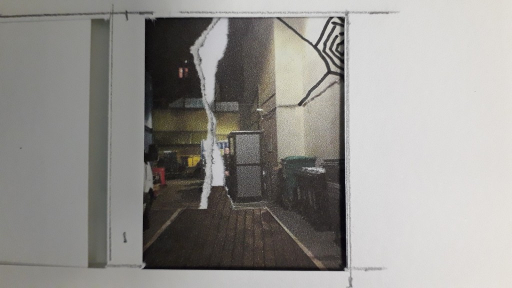
The first challenge is to find a really good photo. Now that I have had a bit of experience with manipulating the photo, I have a better idea what might work. So I plan to go out this weekend to find a good image for next Monday. This means starting again, but I need the practice anyway.
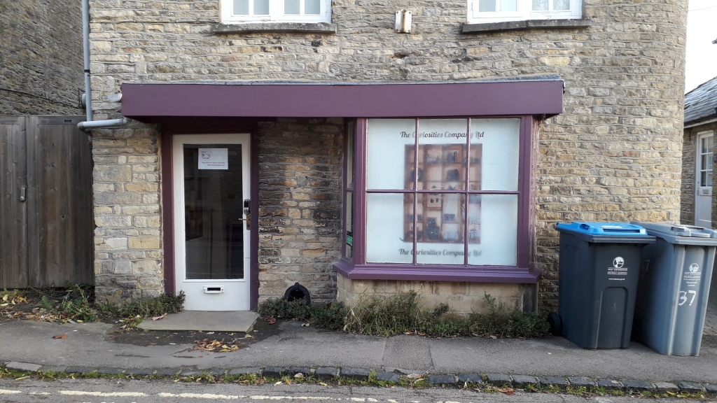
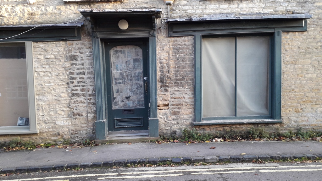
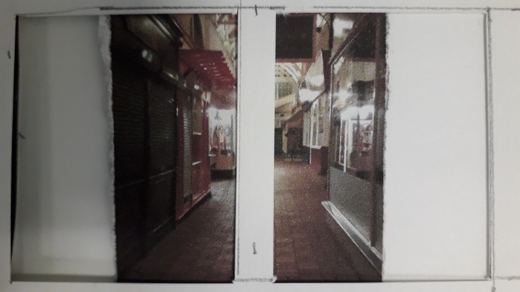
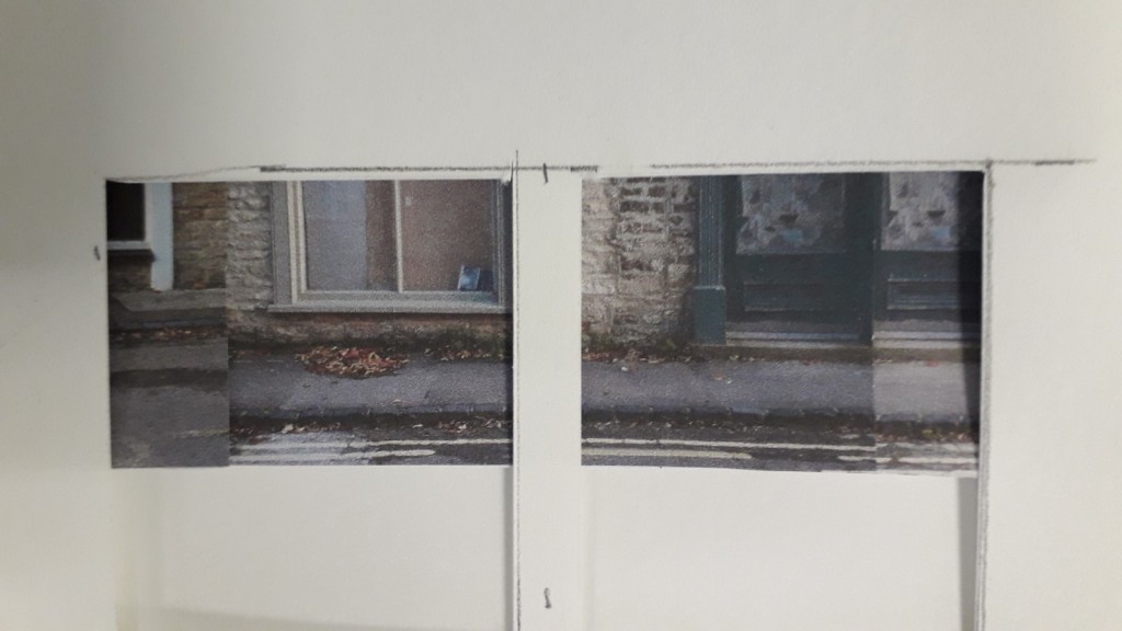
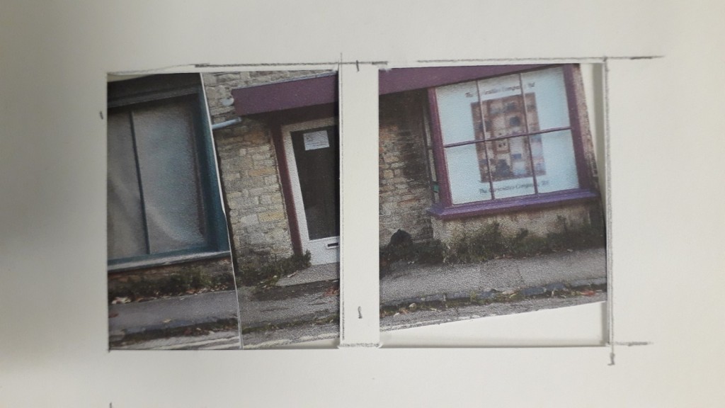
vacant shop fronts in Charlbury
The hands-on approach on the contrary was really exciting and less stressful. I started with my original idea of creating a long narrow picture that goes across the book. The arrangement of abandoned shop fronts however is rather boring. This is partly because there is no silhouette, no interesting skyline. I was inspired for this by an image that Neill showed us (look up?). My next attempts were using the same material, but thinking in more abstract terms. I find the “tiled” approach harmonious, balanced, pleasing also because of the colour. It uses greyed blues with ockre, which is a combination of complementary colours. Below a few experiments putting the photos into the format for the bookcover, without the text. using ripping holes and adding objects with a pen:
Complementary colours? Look for artists? Cezanne has used these combinations..
A tiled approach? Reilley? Klee? Non of this is very useful….
The new photos.
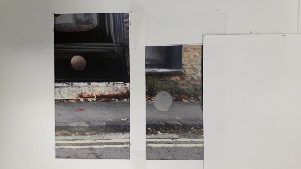
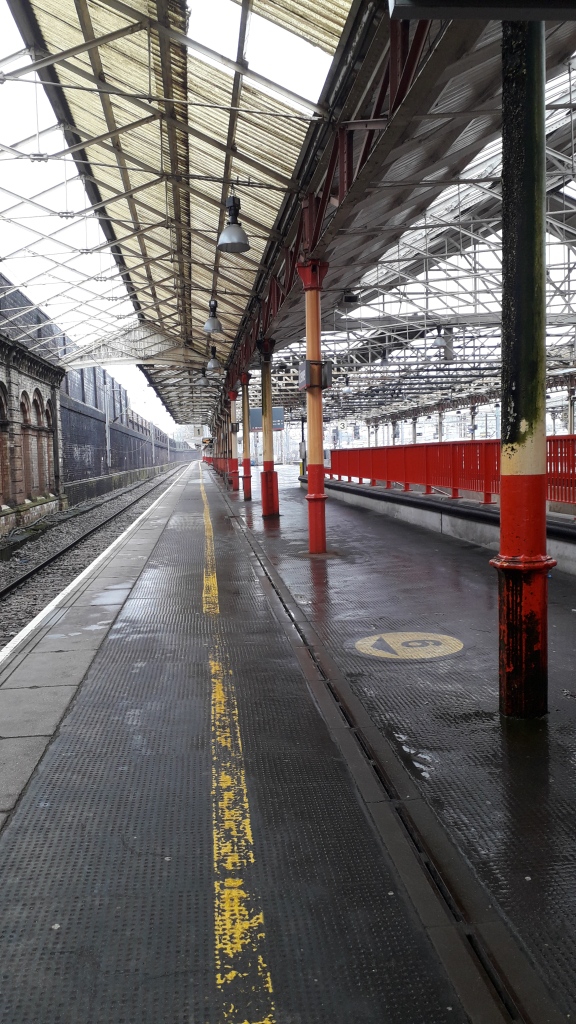
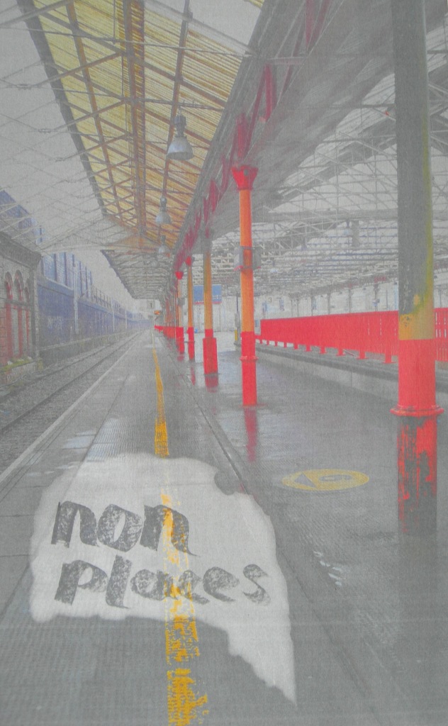
Again on the lookout for more useful photos. The photo of the railway station is appropriate because of the yellow stripe, nice and worn. They both have potential because the empty space in the foreground lends itself for the placement of text, so does the empty sky of the barn photo.
I actually think the unfinished project using the railway station photo and the handwritten text is a start for a really nice design. Such a shame that I was running out of time to continue with it.
Today I have come away from the workshop with some feeling of competence! I am so much more relaxed! And I think I have two designs made with photoshop and InDesign that I feel quite good about. The most important – I feel able to play/experiment with both apps! Hurrah!
I have taken a look at a few of the websites listed in the brief.
Claire Vaccaro
David Pearson
Gabriele Wilson
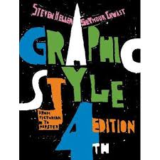
Heller & Chwast
John Gray
Marion Deuchars
Rodrigo Corral
These are all ideas that might be within the boundaries set by my computer skills. In fact quite a few could be done by hand and collage. I enjoy the handwritten texts and could imagine myself doing something like Marion Deuchars’s “the angry island” or Heller & Chwasts’s “graphic design”. If I was to use “the angry island” as a model, I would take the background words from the words used in the briefing. I would use a dull grey colour rather than red, more fitting to the subject. Both these designs have a strong visual impact through the choice of colour.
I tried to set the title of this book with typesetting, which was quite fun.
set in type
I have now tried the ‘angry island’ calligraphy approach. I rather enjoy this minimal approach. The words are all words from the briefing. I tried to vary my writing somewhat, following Deuchars’ example, but it is not so easy as it looks.
reflection / self assessment
The grey and black suits the content of this book, and so does the torn element and the casual style of the handwritten text. The handwriting is not as easy as it looks. My version looks like I squeezed the text to fit the paper (which of course I did!), and even though people tell me I have nice handwriting, I don’t particularly like this. I used a pen that was not flowing well. And maybe the writing of the title should be markedly different from the background. Not sure about the blue letters – I think it would be better all in black. I should give it another try.
Here is the finished bookcover:
I quite like the black-and-white version:
Evaluation: I think my resulting design demonstrates that I can manipulate words and letters, and combine words with photographic material (although you can hardly see that the pixellated areas are photographic). I am satisfied that I have made friends with photoshop and InDesign, or at least have found a way to use these programmes for a simple design. I have used research for design ideas.
Reflection: I was rather hoping that this brief would let me find out more about design in general. But it really was an ongoing uphill battle with technology. I have found out that computer design is not my forte, which is good to know. I wonder now why I didn’t just complete the task by hand? I might have learnt more?
This post probably does not show how I developed the design. I had problems downloading each step of my experimentation. Eventually I managed to print the steps on the way, but could not save them and so they are not available for the blog. My A1 sheets look extremely amateurish and say not enough about the design process.
I chose the 3D workshops because I would like to develop my skills in sculptural design. The brief for the project was to collect data about myself over 7 days. I monitored my fluid intake: water, tea, coffee, orange juice, alcohol, soup = 6 categories. This is what the data look like:
Context: self-monitoring of health data saves the NHS valuable time. There are apps to collect data. For example, carers of older people may use a person centred software (Mobile Care Monitoring) to quickly record fluid intake of their clients. Weight Watchers have an app where participants can record and monitor their weight. Do the risks of such data collection outweigh the benefits? The Cambridge Analytica scandal has shed light on the inner workings of data made accessible on facebook. Lupi and Posavec have demonstrated how much one can learn through data about a person’s lifestyle and character.
“Data artists generally fall into two groups: those who work with large bodies of scientific data and those who are influenced by self-tracking. The Boston-based artist Nathalie Miebach falls into the former category: She transforms weather patterns into complex sculptures and musical scores. Similarly, David McCandless, who believes the world suffers from a “data glut,” turns military spending budgets into simple, striking diagrams. On one level, the genre aims to translate large amounts of information into some kind of aesthetic form. But a number of artists, scholars, and curators also believe that working with this data isn’t just a matter of reducing human beings to numbers, but also of achieving greater awareness of complex matters in a modern world” (Jacoba Urist, May 2015: From Paint to Pixels). There is an online diary Moodjam, which allows users to express their emotions in color patterns. Laurie Frick has used this to monitor her ups and downs and to create her artwork. Frick has also made wood, leather, and paper assemblages based on accounts of her daily activities.
After reading in McCandless‘s “Information is Beautiful” (London. Collins 2012) I see 3 aspects of presenting my data: categorical, quantitative and sequential. The quantitative approach is the first that comes to mind. At the Chipping Norton Art Festival in October there were 2 artists who exhibited all sort of counted data displaying rice heaps on sheets of brown paper ( ‘Of All The People In All The World’, created by acclaimed international performance company Stan’s Cafe). This fascinating and thought-provoking installation uses piles of rice to bring formally abstract statistics to startling and powerful life in a way that is both informative and visually stunning. The impact was enormous. For example evidence of social history – the number of people working in agriculture in 1952 and 2019) ; people living in towns or in the countryside. This is an example of quantitative presentation.
Seen at the Chipping Norton Art Festival Of All The People In All The World – Stan’s Cafe
To start with I can’t think of any other way to present my data. I need to do research to find other ways of presenting data. At the design museum there was a glass cabinet displaying the plastic waste one person produces during a 12h flight – a very literal presentation, very powerful. It reminds me of Lois Weinberger‘s installation ” debris field”, 2019 at the Museum Jean Tinguely in Basel. He had collected objects from the 400yr old family home, which he meticulously cleaned, organised into categories and displayed the categories carefully in boxes.
Exhibition “Debris Field Lois Weinberger” 17. April – 1. September 2019 im Museum Tinguely, Basel
This kind of literal representation is a little more tricky with liquids that have been consumed!
Lupi and Posavec wrote postcards to each other each presenting data collected in a different notation. It is amazing to see how many different ways there are to record data on paper. Their recording methods are impressive. But their work is 2 dimensional and the brief for our assignment is to find 3D visualisations.
Lupi & Posavec: Postcards
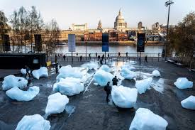
I think about 3D representations of fluids: measuring cups, cups, characteristic parts of cups (handles), solidified fluids (ice, jelly, glass). ELIASSON exhibited ice:
Eliasson’s iceberg installation 2018
Eliasson’s climate change at the Tate Modern, seen 12.12.19
Colour could be used to depict the different liquids. How about using glass beads? Knots? Pencils (convenient, but not very connected to the type of material), found materials such as wooden sticks, felt, paper cups. I decide to look for more inspiration and research various artists, listed on the brief:
Julie Freeman, Laurie Frick and Susie Freeman. I adore their use of colour. When I visited the British Museum recently I saw the installation ‘Cradle to Grave’ by Susie Freeman, a textile artist, David Critchley, a video artist, and Dr Liz Lee, who is a GP, who collectively call themselves Pharmacopoeia. This installation makes visible a whole life’s worth of medication. If I took my lead from that I would have to display 51 cups/mugs/beakers of liquid to represent one week’s fluid.
‘Cradle to grave’ at the British Museum
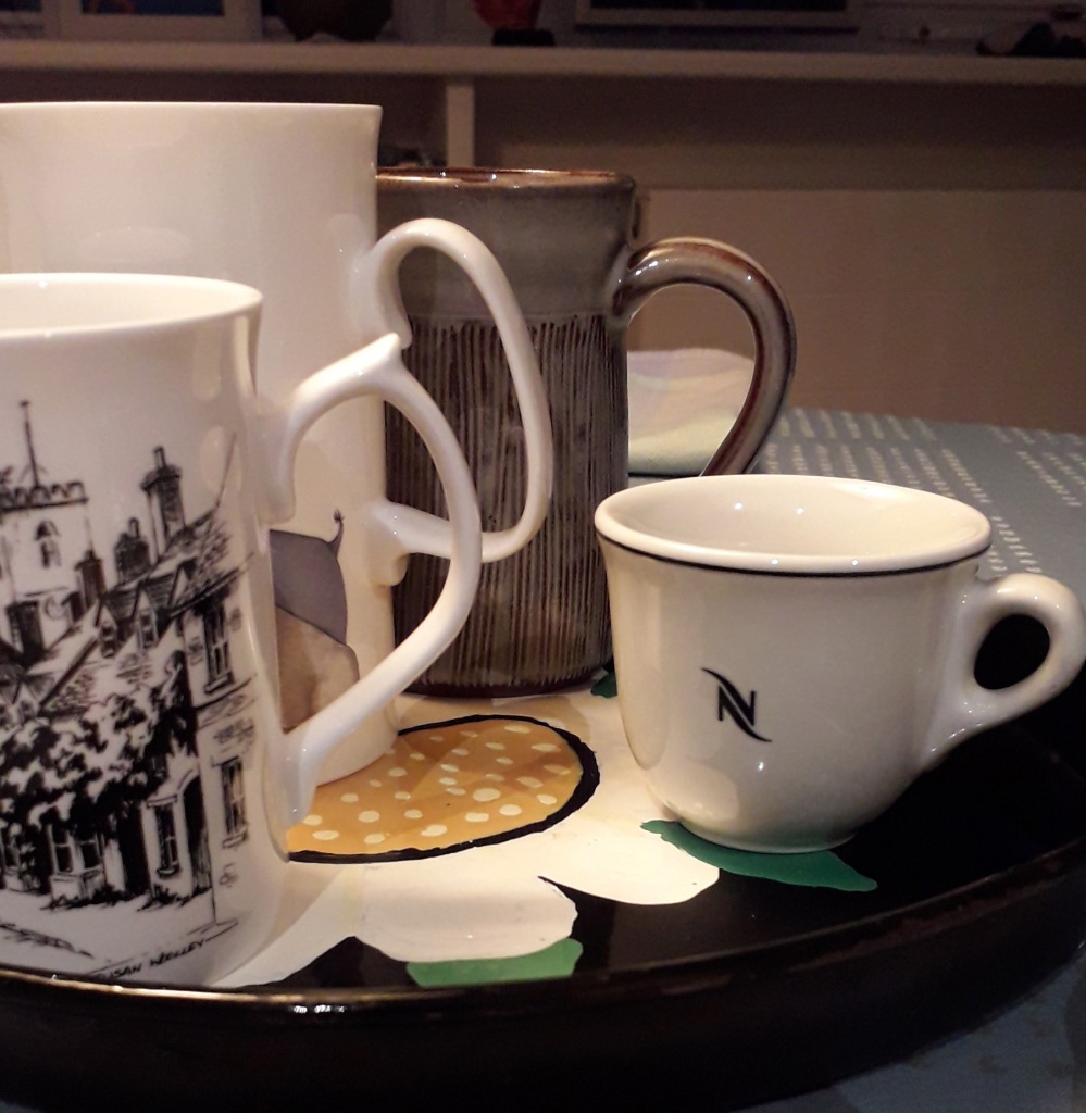
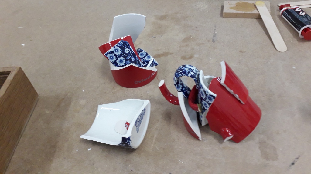
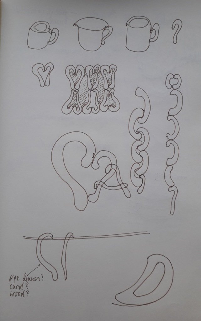
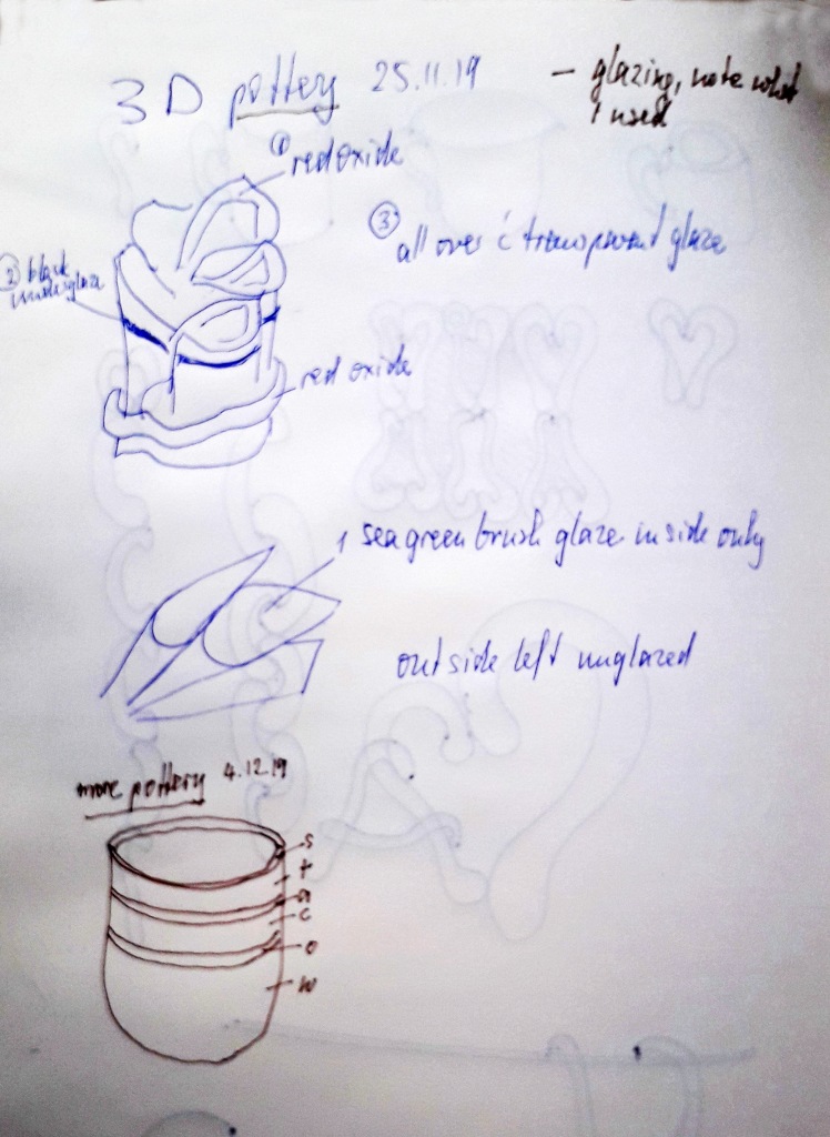
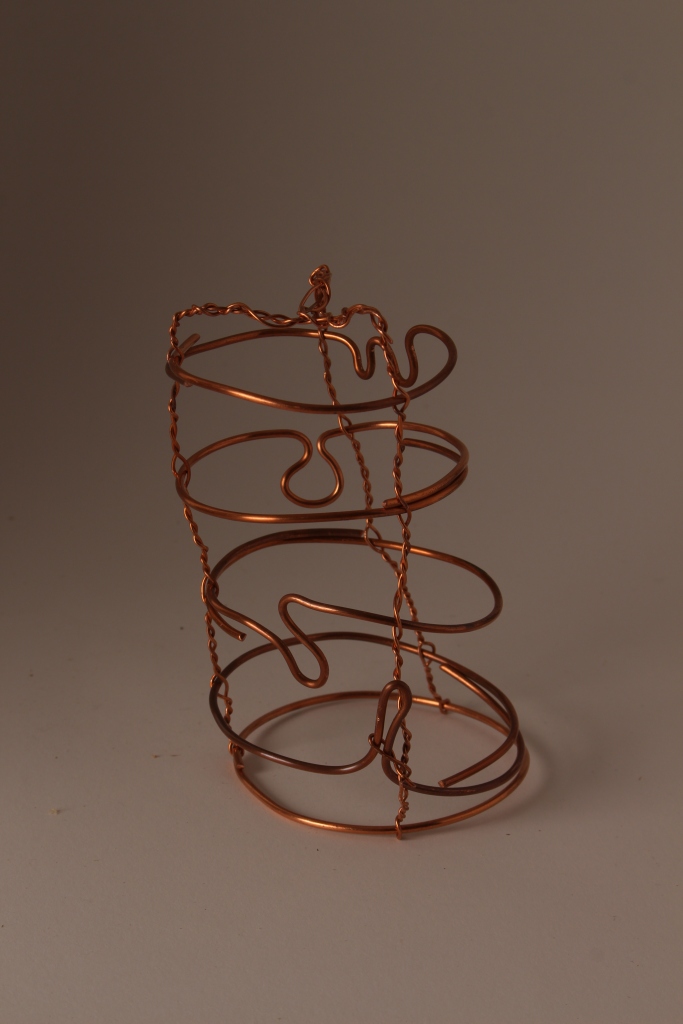
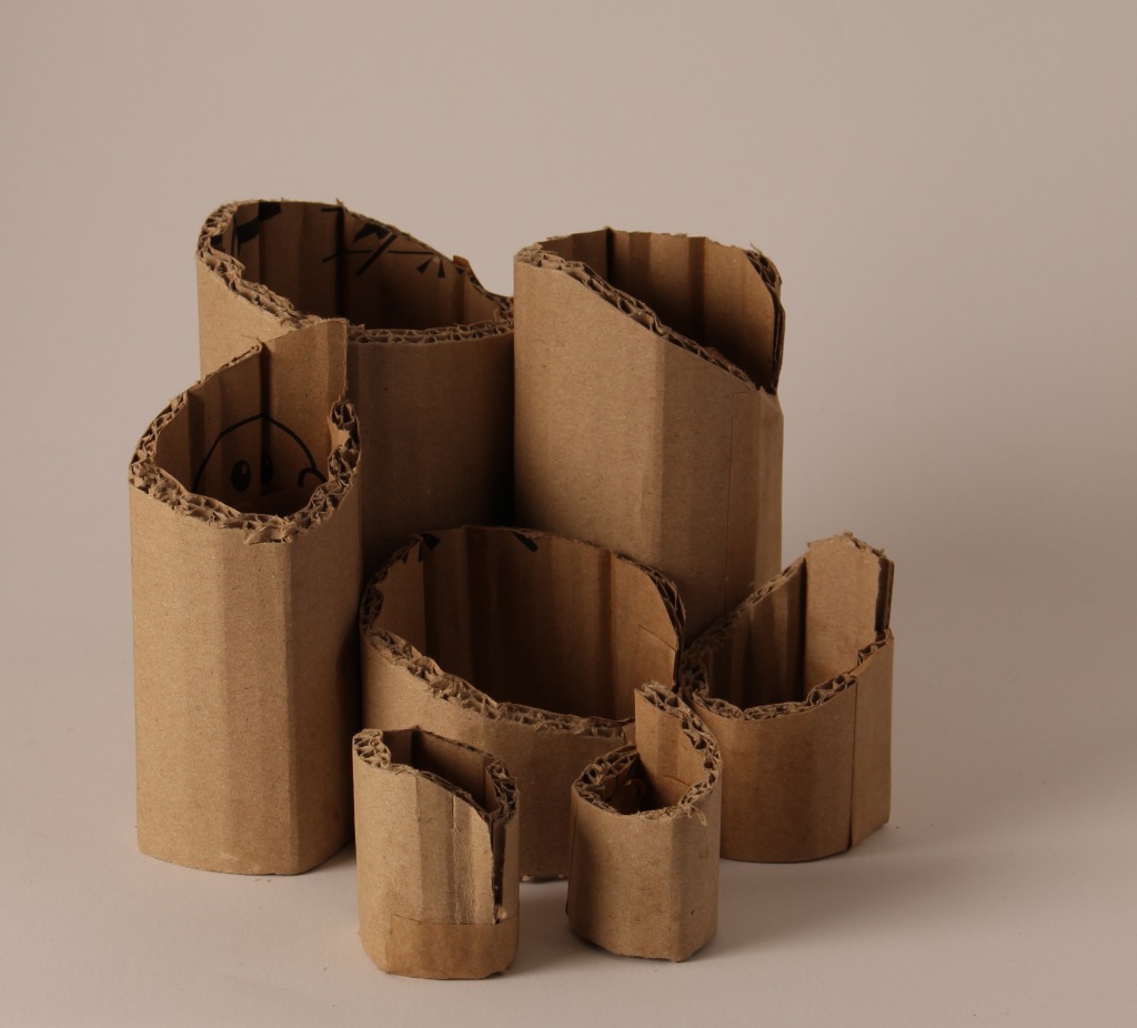
Further thinking around my data made me consider the shape of the measuring vessel, the cup, and I smashed up two damaged mugs from my kitchen and chose the glued-together shards to represent the 6 categories of fluid. I was inspired by the shapes of cup handles and cut them out of plywood to make a mobile. And I experimented with cup shapes using paper clay.
Thinking about materials that were readily available I remembered beads I had in the attic. Each bead stands for one cup of liquid, the colour for the type of liquid.
The constructions with beads made me wonder if I could use something other than thread to make them more into a spatial object, and so started to experiment with wire.
The constructions with beads made me wonder if I could use something other than thread to make them more into a spatial object, and so started to experiment with wire. That was particularly satisfying because it connected with the research about line I did in October and I was reminded about the work of Naomi Grossman and her wire sculptures using words. I wanted to make an object with wire and the the words of each fluid. The wire we had in the workshop was however a bit too solid, so I just ‘wrote’ the first letter instead. I am finding out more about different wire and its characteristics and properties. It seems, the hardness and the rigidity of the wire were an issue. The thinner wire I used to connect the circles was less hard and extremely malleable, but still kept its shape.
Naomi Grossman
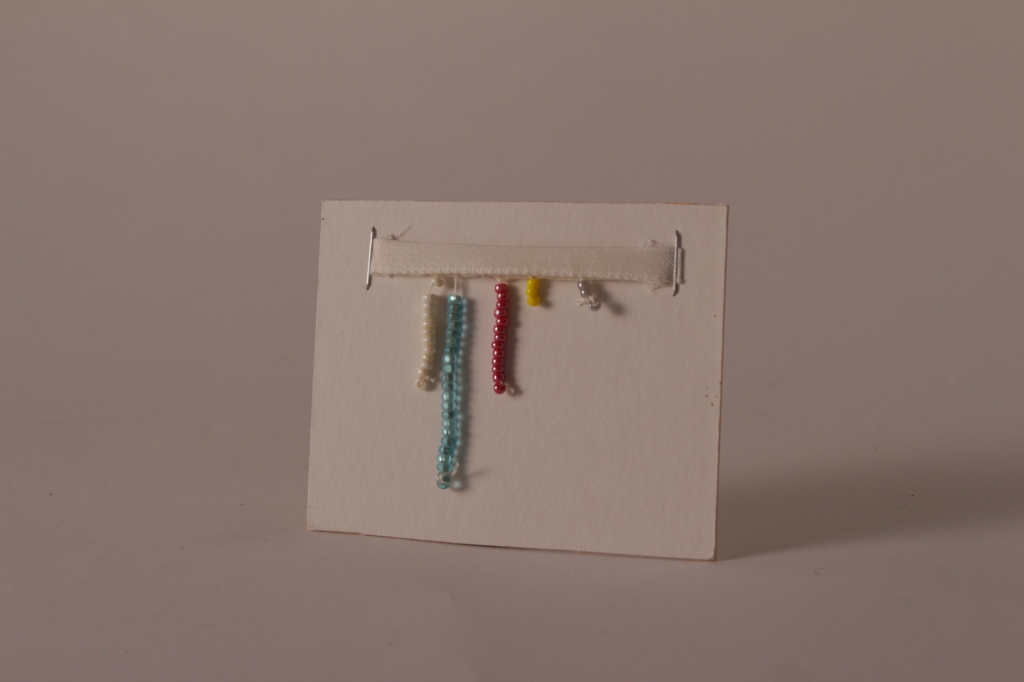
My upside-down beaker with letters
Here you can see the shape of the beaker, but the letters are upside-down. Inside is the resin (solidified fluid) containing seeds
So, here are the completed maquettes so far:
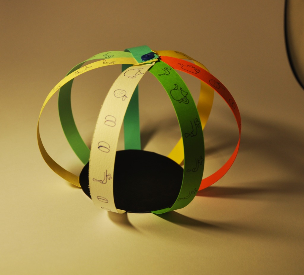
The sides of the orange paper are the 7 days, the punched holes the drink for each day, the paper threads depict the different liquids. A couple of threads must have gone missing!
The lengths of the pencils represent the amount of liquid per type. The wooden base could have been more imaginative – maybe the sides of the base could also have shown the number of cups.
Whereas for the previous object the shards were glued together, here I experimented with firing them in the kiln to stick them together. It worked, but the red of the second cup disappeared, because it was not a glaze.
Deliberately placed upside down, as the cups are empty. I like the shape.
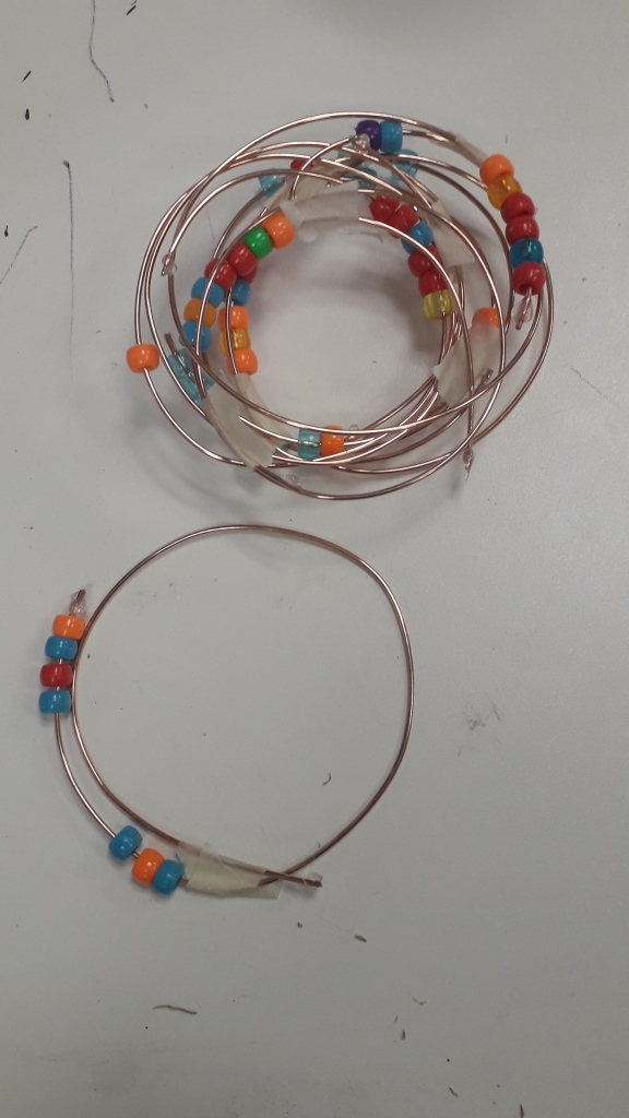
7 days in sequence; the black beads indicate the beginning of a new day. this could be developed into jewellery.
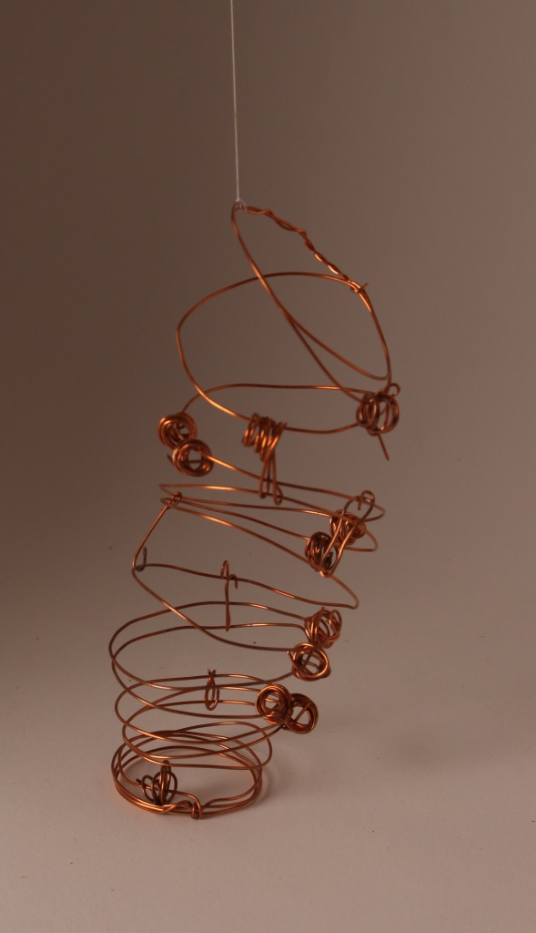
upside-down bar chart
7 wires, one for each day, containing the colour-coded drinks in form of pearls. I like this object. Made with more beautiful pearls, it could be a sculpture. As the pearls are not fixed and move on the wire, it invites play, so could be a toy. I had to use glue – welding would enhance the attractivity of this object. It could also be developed into a structure on a playground.
My plan was to indicate in proportions the number of cups per type of liquid with different glazes and oxides. But I think the cup in itself is a pleasing shape.
It should be 6 cups (did I lose one?), one for each type of liquid. My cups become more and more disfunctional, the smallest with a whole in the bottom. i enjoy their irregular shapes.
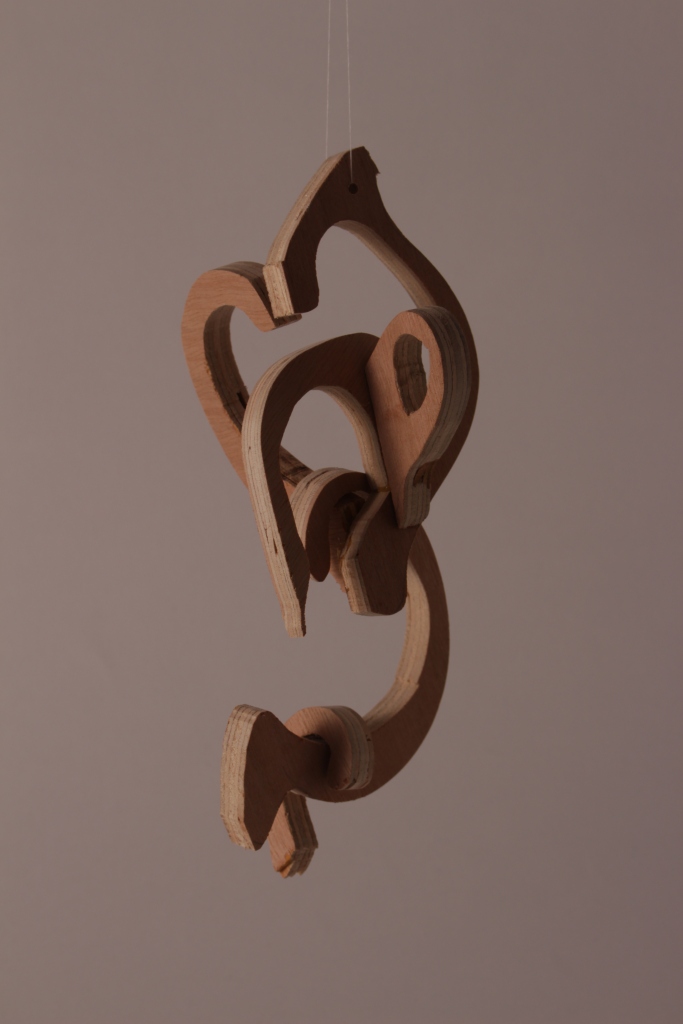
I particularly like this mobile, made from different sizes cuphandle shapes out of plywood. I enjoy when it turns to form a bit of a heart-shape. Maybe colour could add something?
I am so pleased I found the dragon paper in my cupboard. I could now look for something that moves in this kaleidoscope….
After struggling with the copper wire available in the workshop, I wanted to find out what can be done with a softer, more pliable and thinner wire. Clearly, this one doesn’t hold its shape so well, and I had to tie the spirals with a wire grip to ensure the cup shape that I was after. I love the reflection of light on the wire.
Inspired by Grossman, this upside-down wire cup contains the first letter of each liquid (well, almost each – I gave up on “a” and “c”).
Each seed is a cup of liquid
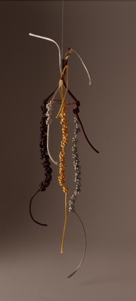
Chinese Knot Rattail Mobile
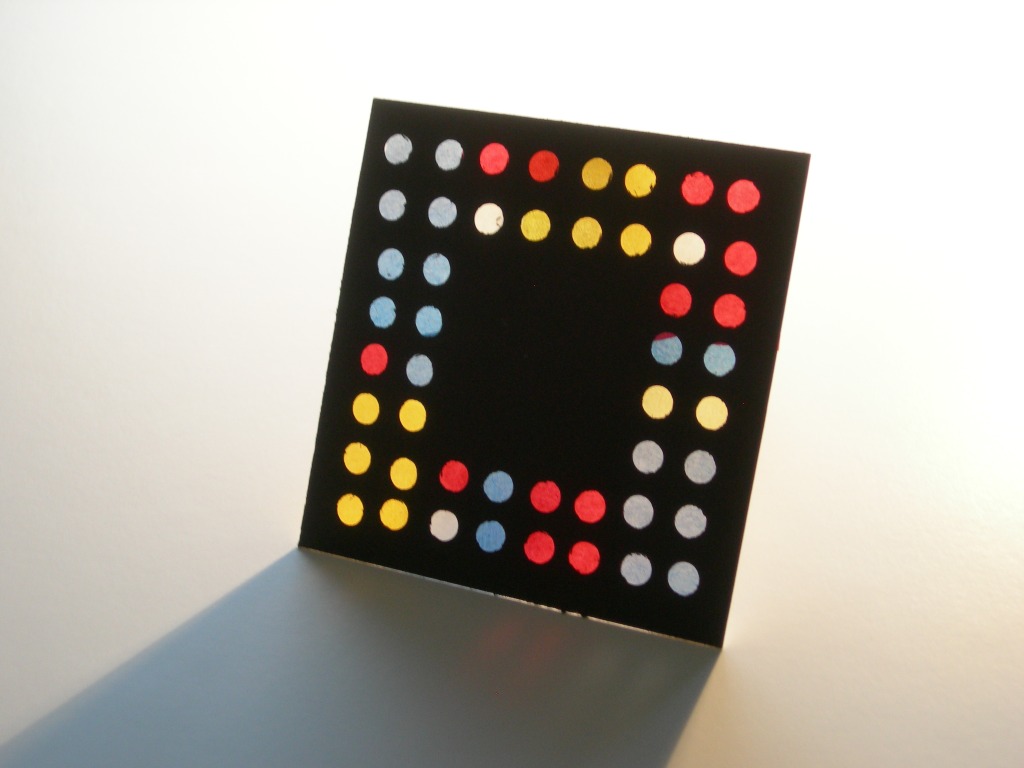
grey = water
gold = tea
brown = coffee
white = alcohol
burgundy = soup
using cut-offs
reflection
Each object led to either a slightly different version, or made me think up a completely new approach. The creative process is an interesting thing. I went through phases of thinking I had exhausted my ideas, but then, either triggered by something I saw, or seemingly coming out of the blue, new ideas emerged. Sometimes something happened during the ‘making’ process. For example I made the string of chinese knots before I knew how to present them, but then I played with the finished strings and thought of making a mobile. The bonus with the mobile is the way that the rattails are dancing, looking almost human. Similarly with the wooden handles. I had a different idea of presenting them, but playing with them made me see what a pleasant object they become as a mobile. Now that I have gone through these processes, it could be interesting to revisit some found material to explore more imaginative options.
To work with wire as material was a real discovery. I would love to do some more. maybe I can ask a friend to lend me a welding tool.
I am not sure what to think about my attention to finishing touches. The clay objects are all still quite rough. I did want to make dysfunctional cups, as my way of measuring was also not very precise. But as objects I am not sure if I am satisfied with the overall look. As they are maquettes, rather than finished sculptures, maybe that is ok.
I have also been reflecting on the science behind this. At first it seems quite simple, objects are counted and then somehow presented. But the 3D adds geometry! Not something I am very familiar with. It was mindblowing to see the Eliasson exhibition last week. The first room with 300 models – paper, wire (oh wonderful!), leather, cardboard, wood….. I am so inspired, particularly to find all these wonderful wire models! I looked up a book at the Tate Modern: Jon Allen ‘Making Geometry’ Floris Books. If I choose 3D for the next semester, maybe that would be worth studying.
Eliasson’s models at the Tate Modern Dec 2019
4. Jan 2020. It seems amazing, but I now continue on this road and think up more shapes. there is hardly a day when I don’t think of a new shape. I want to explore wire as material more, and get very thin, very plyable wire which I make into a cup shape (or cup holder). Then I measure the lengths of wire to represent the quantity of each category, and find I can make a wire snow drop and a human figure, still representing my data.
I made a mould from clay for the wire cup below.
wire cup or cup holder
snowdrop
figure
4 Jan 2020. Two days ago I looked at my objects with an artist friend, and he was wondering how some of these would look big, maybe using different material. Some already look like they could be in a children’s playground. Or a water feature in a garden. Or a mobile a la Calder.
data expanded to 7 days – this was a lot of work!!!back to basics: felt strips glued together
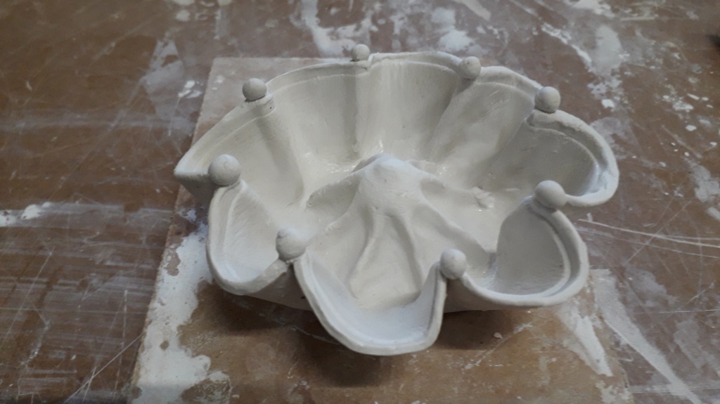
Paper Clay, thumb pot.
paper mache. using a positive mould provides not as much definition as a negative mould.
back to simple strips of paper, one strip for each day. This structure too could be in a playground.
I made this with dragon paper. I was reminded of a piece of art in the Peggy Guggenheim Museum. The drink is colour coded, but not arranged in a sequence.
Handle Shapes from paper clay, each mark represents a cup of liquid. What a beautiful material to work with! I want to do more.
more research
12.01.2020 I have listened to a presentation by Laurie Frick. She tells the audience about the fascination of finding data about herself. It is like finding out things about yourself that were hidden, secret. I am excited about her approach, but at the same time question the point of it all! I also listened to Carrie Roy’s presentation “When art collides with data”. She talks about three data challenges: 1. grabbing attention; 2 making abstracts tangible; 3 tackling complexity. Which one of my objects, if any, addresses all three? Well, what a surprise, the very first little experiment with orange paper! The colour calls for attention, the presentation is easy to understand, and it tackles both aspects of the data (how much each day, of which liquid). And I nearly discarded it as rubbish! Many of my other objects are aesthetically pleasing, and have been fun to create, but need more effort to understand them.
evaluation
It has been fascinating to generate ideas in response to this brief. It became a game for me, and was playful and fun. I am not sure that I have “meaningfully translated data” – when I showed my objects to people they required some explanation. I can see how such creative designs could be useful for other projects, i.e. architecture, textiles, sculpture, or visual art.
I have learnt a lot about the materials I used – wood, wire, beads, glue clay. I made some technical notes in the diary and in the sketchbook, but struggled rather to keep up with the pace. I enjoyed reading and looking up data artists and have enjoyed getting to know this for me quite new world.
I have been given more wire to experiment with – so, maybe this exploration is not finished yet!