I chose the 3D workshops because I would like to develop my skills in sculptural design. The brief for the project was to collect data about myself over 7 days. I monitored my fluid intake: water, tea, coffee, orange juice, alcohol, soup = 6 categories. This is what the data look like:


Context: self-monitoring of health data saves the NHS valuable time. There are apps to collect data. For example, carers of older people may use a person centred software (Mobile Care Monitoring) to quickly record fluid intake of their clients. Weight Watchers have an app where participants can record and monitor their weight. Do the risks of such data collection outweigh the benefits? The Cambridge Analytica scandal has shed light on the inner workings of data made accessible on facebook. Lupi and Posavec have demonstrated how much one can learn through data about a person’s lifestyle and character.
“Data artists generally fall into two groups: those who work with large bodies of scientific data and those who are influenced by self-tracking. The Boston-based artist Nathalie Miebach falls into the former category: She transforms weather patterns into complex sculptures and musical scores. Similarly, David McCandless, who believes the world suffers from a “data glut,” turns military spending budgets into simple, striking diagrams. On one level, the genre aims to translate large amounts of information into some kind of aesthetic form. But a number of artists, scholars, and curators also believe that working with this data isn’t just a matter of reducing human beings to numbers, but also of achieving greater awareness of complex matters in a modern world” (Jacoba Urist, May 2015: From Paint to Pixels). There is an online diary Moodjam, which allows users to express their emotions in color patterns. Laurie Frick has used this to monitor her ups and downs and to create her artwork. Frick has also made wood, leather, and paper assemblages based on accounts of her daily activities.
After reading in McCandless‘s “Information is Beautiful” (London. Collins 2012) I see 3 aspects of presenting my data: categorical, quantitative and sequential. The quantitative approach is the first that comes to mind. At the Chipping Norton Art Festival in October there were 2 artists who exhibited all sort of counted data displaying rice heaps on sheets of brown paper ( ‘Of All The People In All The World’, created by acclaimed international performance company Stan’s Cafe). This fascinating and thought-provoking installation uses piles of rice to bring formally abstract statistics to startling and powerful life in a way that is both informative and visually stunning. The impact was enormous. For example evidence of social history – the number of people working in agriculture in 1952 and 2019) ; people living in towns or in the countryside. This is an example of quantitative presentation.

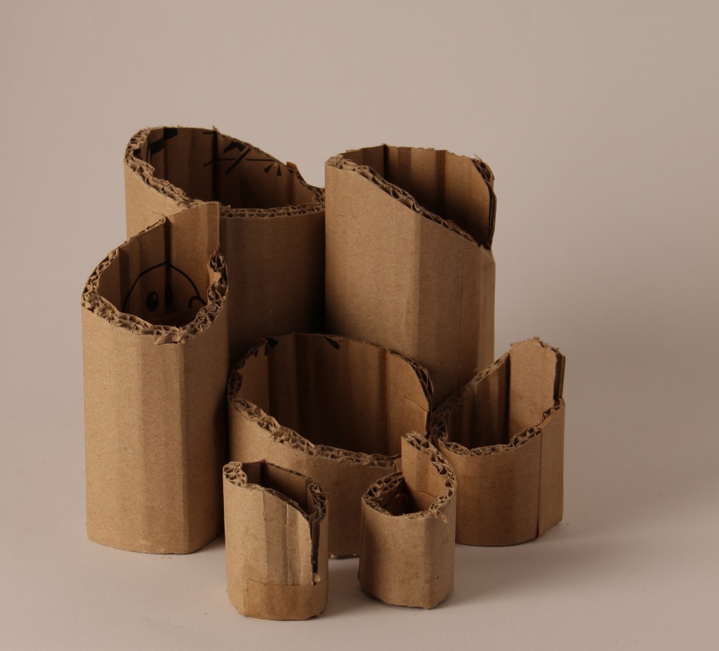
To start with I can’t think of any other way to present my data. I need to do research to find other ways of presenting data. At the design museum there was a glass cabinet displaying the plastic waste one person produces during a 12h flight – a very literal presentation, very powerful. It reminds me of Lois Weinberger‘s installation ” debris field”, 2019 at the Museum Jean Tinguely in Basel. He had collected objects from the 400yr old family home, which he meticulously cleaned, organised into categories and displayed the categories carefully in boxes.

This kind of literal representation is a little more tricky with liquids that have been consumed!
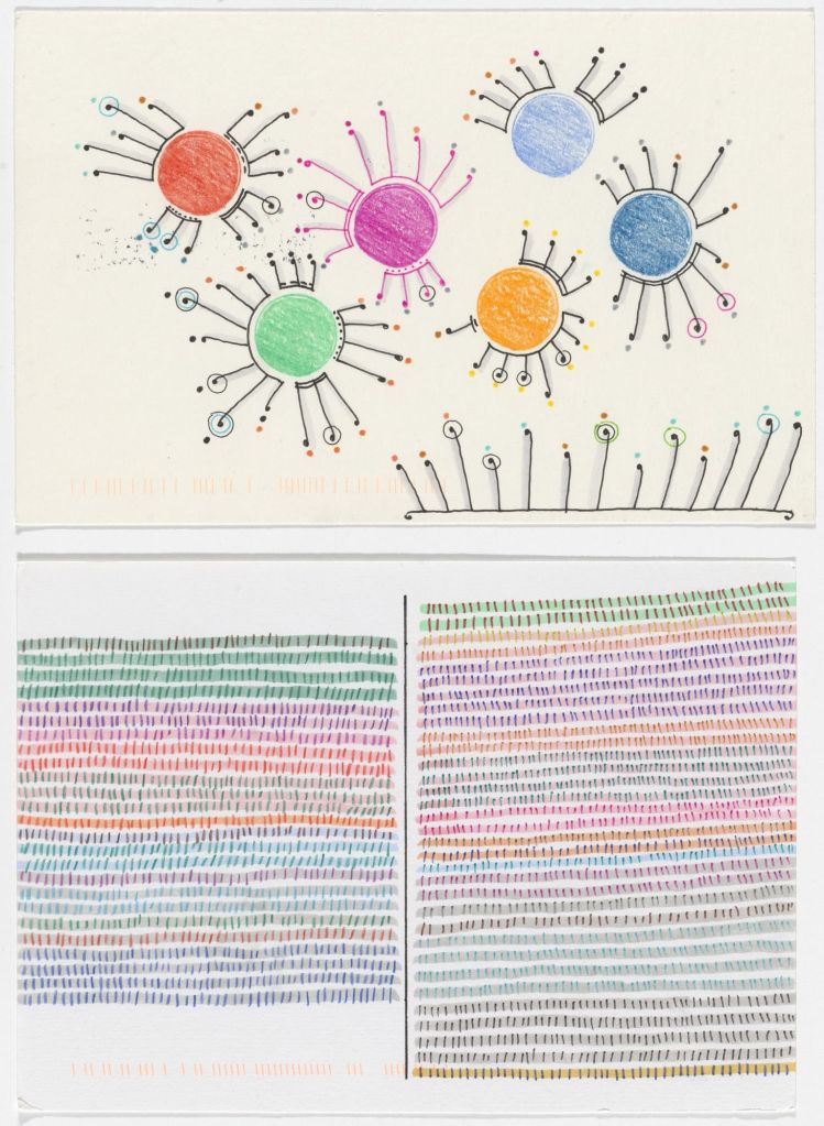
Lupi and Posavec wrote postcards to each other each presenting data collected in a different notation. It is amazing to see how many different ways there are to record data on paper. Their recording methods are impressive. But their work is 2 dimensional and the brief for our assignment is to find 3D visualisations.

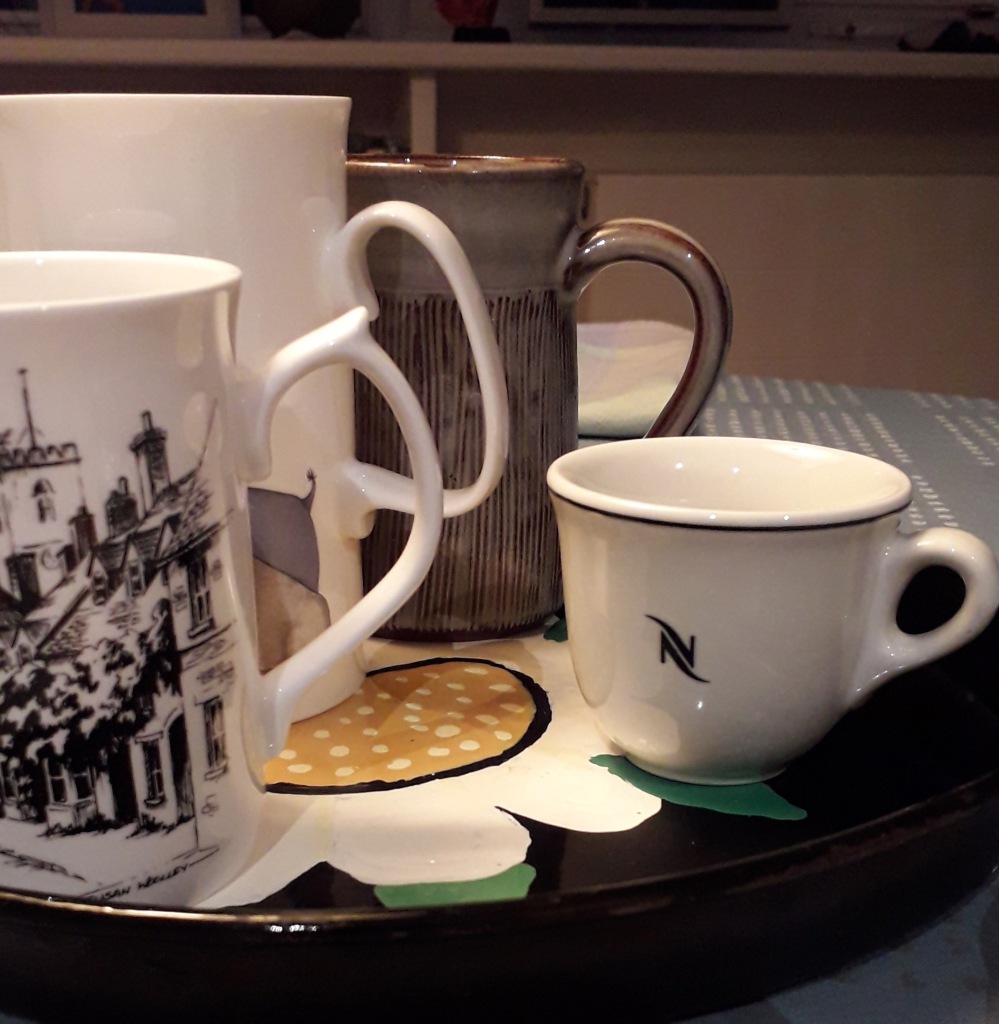
I think about 3D representations of fluids: measuring cups, cups, characteristic parts of cups (handles), solidified fluids (ice, jelly, glass). ELIASSON exhibited ice:
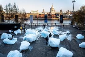
Eliasson’s iceberg installation 2018

Eliasson’s climate change at the Tate Modern, seen 12.12.19
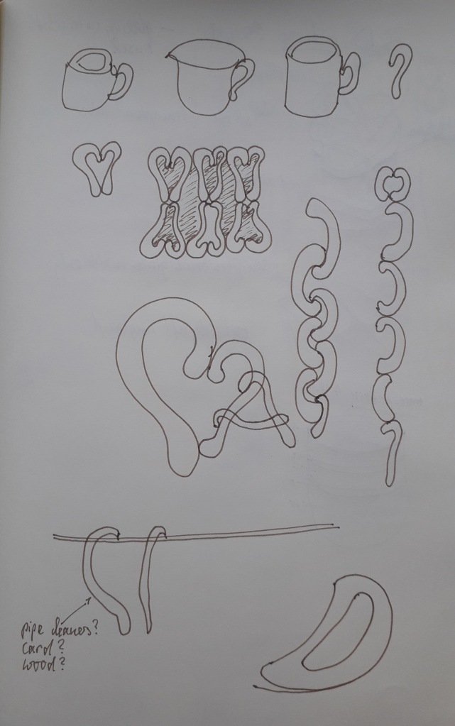
Colour could be used to depict the different liquids. How about using glass beads? Knots? Pencils (convenient, but not very connected to the type of material), found materials such as wooden sticks, felt, paper cups. I decide to look for more inspiration and research various artists, listed on the brief:


Julie Freeman, Laurie Frick and Susie Freeman. I adore their use of colour. When I visited the British Museum recently I saw the installation ‘Cradle to Grave’ by Susie Freeman, a textile artist, David Critchley, a video artist, and Dr Liz Lee, who is a GP, who collectively call themselves Pharmacopoeia. This installation makes visible a whole life’s worth of medication. If I took my lead from that I would have to display 51 cups/mugs/beakers of liquid to represent one week’s fluid.

‘Cradle to grave’ at the British Museum
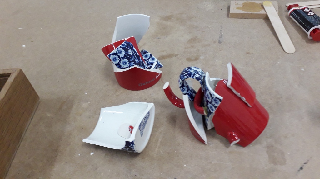
Further thinking around my data made me consider the shape of the measuring vessel, the cup, and I smashed up two damaged mugs from my kitchen and chose the glued-together shards to represent the 6 categories of fluid. I was inspired by the shapes of cup handles and cut them out of plywood to make a mobile. And I experimented with cup shapes using paper clay.


Thinking about materials that were readily available I remembered beads I had in the attic. Each bead stands for one cup of liquid, the colour for the type of liquid.
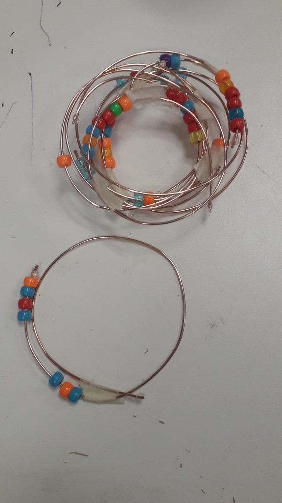
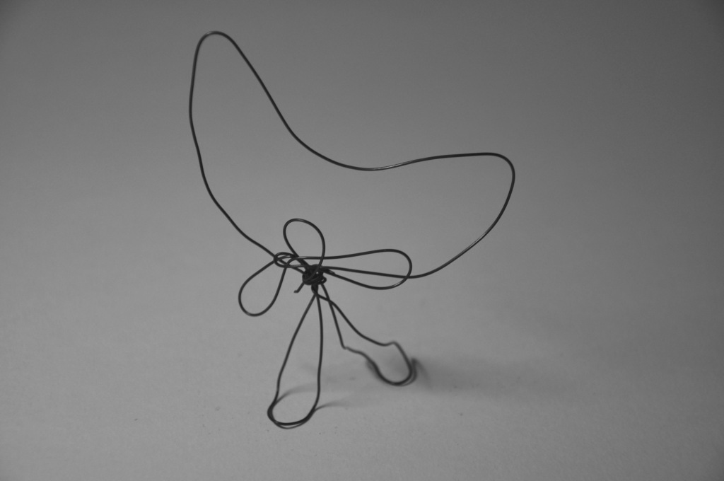
The constructions with beads made me wonder if I could use something other than thread to make them more into a spatial object, and so started to experiment with wire.
The constructions with beads made me wonder if I could use something other than thread to make them more into a spatial object, and so started to experiment with wire. That was particularly satisfying because it connected with the research about line I did in October and I was reminded about the work of Naomi Grossman and her wire sculptures using words. I wanted to make an object with wire and the the words of each fluid. The wire we had in the workshop was however a bit too solid, so I just ‘wrote’ the first letter instead. I am finding out more about different wire and its characteristics and properties. It seems, the hardness and the rigidity of the wire were an issue. The thinner wire I used to connect the circles was less hard and extremely malleable, but still kept its shape.

Naomi Grossman 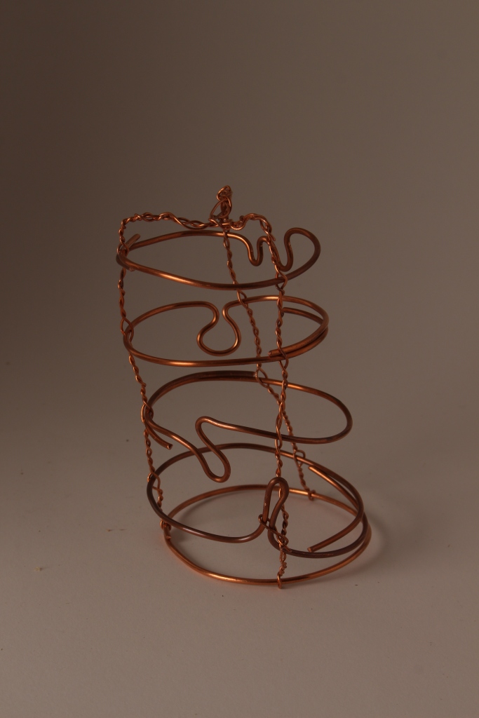
My upside-down beaker with letters 
Here you can see the shape of the beaker, but the letters are upside-down. Inside is the resin (solidified fluid) containing seeds
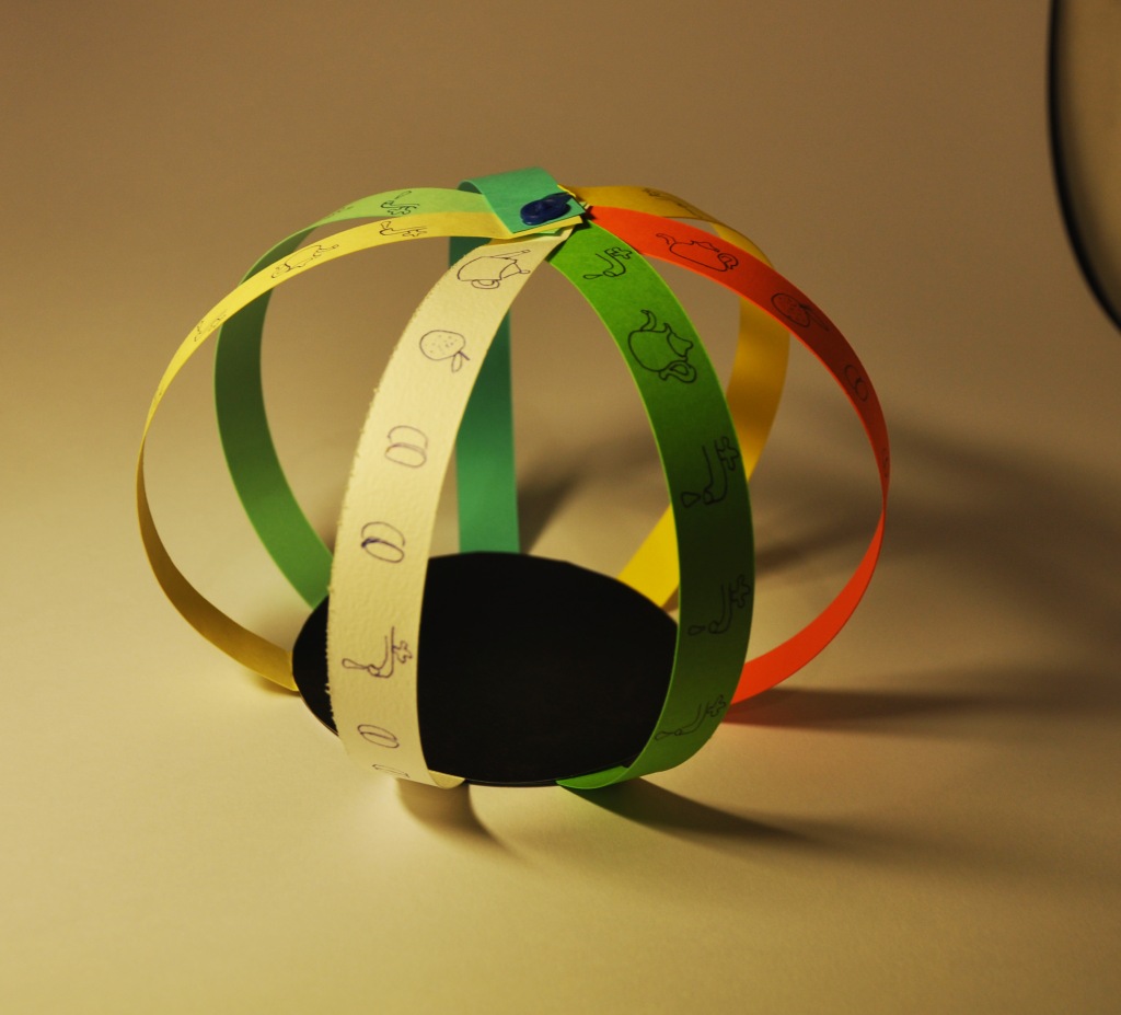
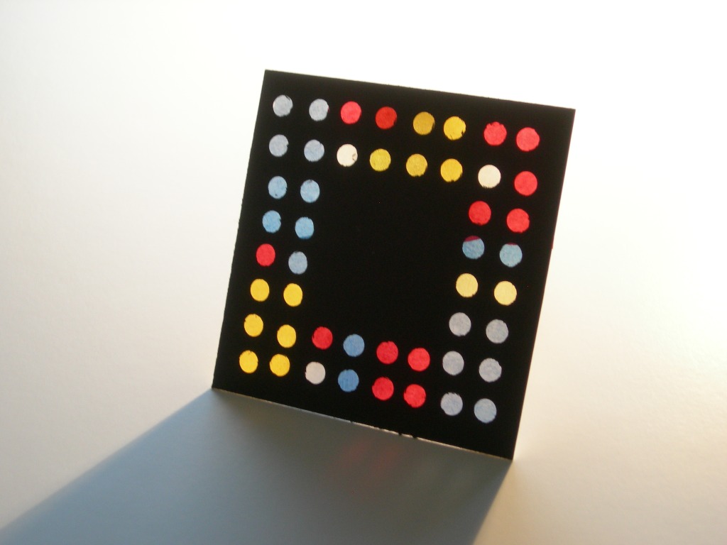
So, here are the completed maquettes so far:

The sides of the orange paper are the 7 days, the punched holes the drink for each day, the paper threads depict the different liquids. A couple of threads must have gone missing!

The lengths of the pencils represent the amount of liquid per type. The wooden base could have been more imaginative – maybe the sides of the base could also have shown the number of cups.


Whereas for the previous object the shards were glued together, here I experimented with firing them in the kiln to stick them together. It worked, but the red of the second cup disappeared, because it was not a glaze.

Deliberately placed upside down, as the cups are empty. I like the shape.

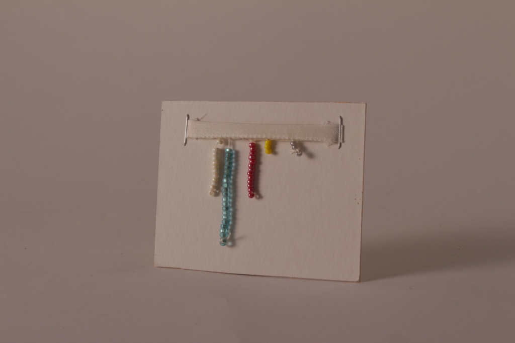
7 days in sequence; the black beads indicate the beginning of a new day. this could be developed into jewellery.
upside-down bar chart

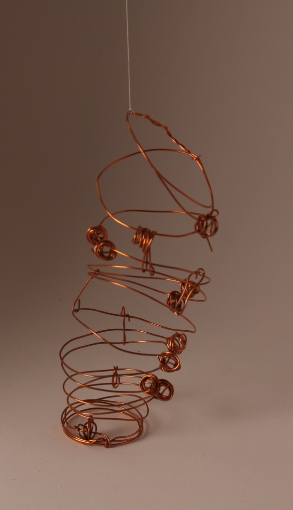
7 wires, one for each day, containing the colour-coded drinks in form of pearls. I like this object. Made with more beautiful pearls, it could be a sculpture. As the pearls are not fixed and move on the wire, it invites play, so could be a toy. I had to use glue – welding would enhance the attractivity of this object. It could also be developed into a structure on a playground.

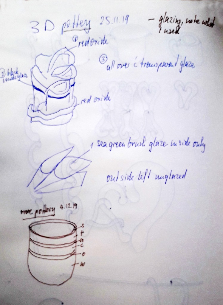
My plan was to indicate in proportions the number of cups per type of liquid with different glazes and oxides. But I think the cup in itself is a pleasing shape.


It should be 6 cups (did I lose one?), one for each type of liquid. My cups become more and more disfunctional, the smallest with a whole in the bottom. i enjoy their irregular shapes.
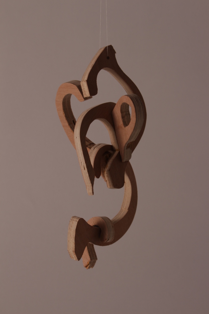
I particularly like this mobile, made from different sizes cuphandle shapes out of plywood. I enjoy when it turns to form a bit of a heart-shape. Maybe colour could add something?

I am so pleased I found the dragon paper in my cupboard. I could now look for something that moves in this kaleidoscope….
After struggling with the copper wire available in the workshop, I wanted to find out what can be done with a softer, more pliable and thinner wire. Clearly, this one doesn’t hold its shape so well, and I had to tie the spirals with a wire grip to ensure the cup shape that I was after. I love the reflection of light on the wire.

Inspired by Grossman, this upside-down wire cup contains the first letter of each liquid (well, almost each – I gave up on “a” and “c”).

Each seed is a cup of liquid


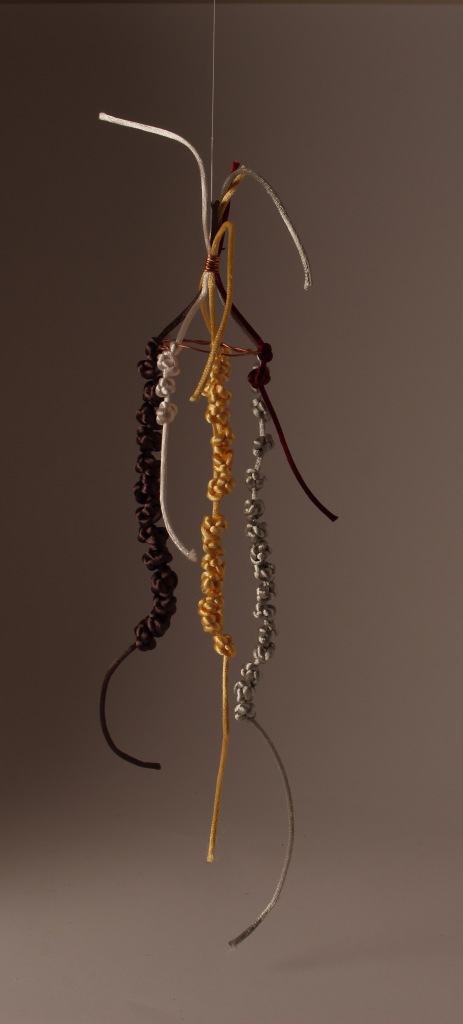
Chinese Knot Rattail Mobile
grey = water
gold = tea
brown = coffee
white = alcohol
burgundy = soup

using cut-offs
reflection
Each object led to either a slightly different version, or made me think up a completely new approach. The creative process is an interesting thing. I went through phases of thinking I had exhausted my ideas, but then, either triggered by something I saw, or seemingly coming out of the blue, new ideas emerged. Sometimes something happened during the ‘making’ process. For example I made the string of chinese knots before I knew how to present them, but then I played with the finished strings and thought of making a mobile. The bonus with the mobile is the way that the rattails are dancing, looking almost human. Similarly with the wooden handles. I had a different idea of presenting them, but playing with them made me see what a pleasant object they become as a mobile. Now that I have gone through these processes, it could be interesting to revisit some found material to explore more imaginative options.
To work with wire as material was a real discovery. I would love to do some more. maybe I can ask a friend to lend me a welding tool.
I am not sure what to think about my attention to finishing touches. The clay objects are all still quite rough. I did want to make dysfunctional cups, as my way of measuring was also not very precise. But as objects I am not sure if I am satisfied with the overall look. As they are maquettes, rather than finished sculptures, maybe that is ok.
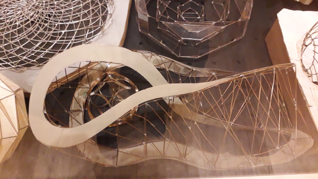
I have also been reflecting on the science behind this. At first it seems quite simple, objects are counted and then somehow presented. But the 3D adds geometry! Not something I am very familiar with. It was mindblowing to see the Eliasson exhibition last week. The first room with 300 models – paper, wire (oh wonderful!), leather, cardboard, wood….. I am so inspired, particularly to find all these wonderful wire models! I looked up a book at the Tate Modern: Jon Allen ‘Making Geometry’ Floris Books. If I choose 3D for the next semester, maybe that would be worth studying.


4. Jan 2020. It seems amazing, but I now continue on this road and think up more shapes. there is hardly a day when I don’t think of a new shape. I want to explore wire as material more, and get very thin, very plyable wire which I make into a cup shape (or cup holder). Then I measure the lengths of wire to represent the quantity of each category, and find I can make a wire snow drop and a human figure, still representing my data.

I made a mould from clay for the wire cup below.


4 Jan 2020. Two days ago I looked at my objects with an artist friend, and he was wondering how some of these would look big, maybe using different material. Some already look like they could be in a children’s playground. Or a water feature in a garden. Or a mobile a la Calder.


Paper Clay, thumb pot.

paper mache. using a positive mould provides not as much definition as a negative mould.
back to simple strips of paper, one strip for each day. This structure too could be in a playground.

I made this with dragon paper. I was reminded of a piece of art in the Peggy Guggenheim Museum. The drink is colour coded, but not arranged in a sequence.

Handle Shapes from paper clay, each mark represents a cup of liquid. What a beautiful material to work with! I want to do more.
more research
12.01.2020 I have listened to a presentation by Laurie Frick. She tells the audience about the fascination of finding data about herself. It is like finding out things about yourself that were hidden, secret. I am excited about her approach, but at the same time question the point of it all! I also listened to Carrie Roy’s presentation “When art collides with data”. She talks about three data challenges: 1. grabbing attention; 2 making abstracts tangible; 3 tackling complexity. Which one of my objects, if any, addresses all three? Well, what a surprise, the very first little experiment with orange paper! The colour calls for attention, the presentation is easy to understand, and it tackles both aspects of the data (how much each day, of which liquid). And I nearly discarded it as rubbish! Many of my other objects are aesthetically pleasing, and have been fun to create, but need more effort to understand them.
evaluation
It has been fascinating to generate ideas in response to this brief. It became a game for me, and was playful and fun. I am not sure that I have “meaningfully translated data” – when I showed my objects to people they required some explanation. I can see how such creative designs could be useful for other projects, i.e. architecture, textiles, sculpture, or visual art.
I have learnt a lot about the materials I used – wood, wire, beads, glue clay. I made some technical notes in the diary and in the sketchbook, but struggled rather to keep up with the pace. I enjoyed reading and looking up data artists and have enjoyed getting to know this for me quite new world.
I have been given more wire to experiment with – so, maybe this exploration is not finished yet!
